
Learning from Lou Dorfsman

One of my all-time favorite design books, Dorfsman & CBS is a superlative education in typography and the handling of two-dimensional space. Lou Dorfsman worked at CBS for forty years in the mid-20th century, functioning as their de facto creative director before the term was in common use. He developed an entire visual language for the network, and used it to design everything from the cups in the CBS cafeteria to print advertising, on-air motion graphics, and signage systems for their Manhattan headquarters. This impressive monograph beautifully showcases Dorfsman's work, which still looks brilliant and modern decades later. First published in 1987, Dorfsman & CBS is a joy to experience, and I learn something new every time I open the cover.

1955 trade publicity photo of Lou Dorfsman surrounded by some of his design work for CBS.

In the early 1960s, Dorfsman worked with type designers to develop the beautiful CBS Didone corporate font that was used on signage and other materials throughout the network’s headquarters building in New York.

The poster-style treatment of this 1962 newspaper ad implied an event of artistic significance. The contrast in size and scale of the juxtaposed photos heightened the drama; an example of deft maneuvers with stock promotional photos.
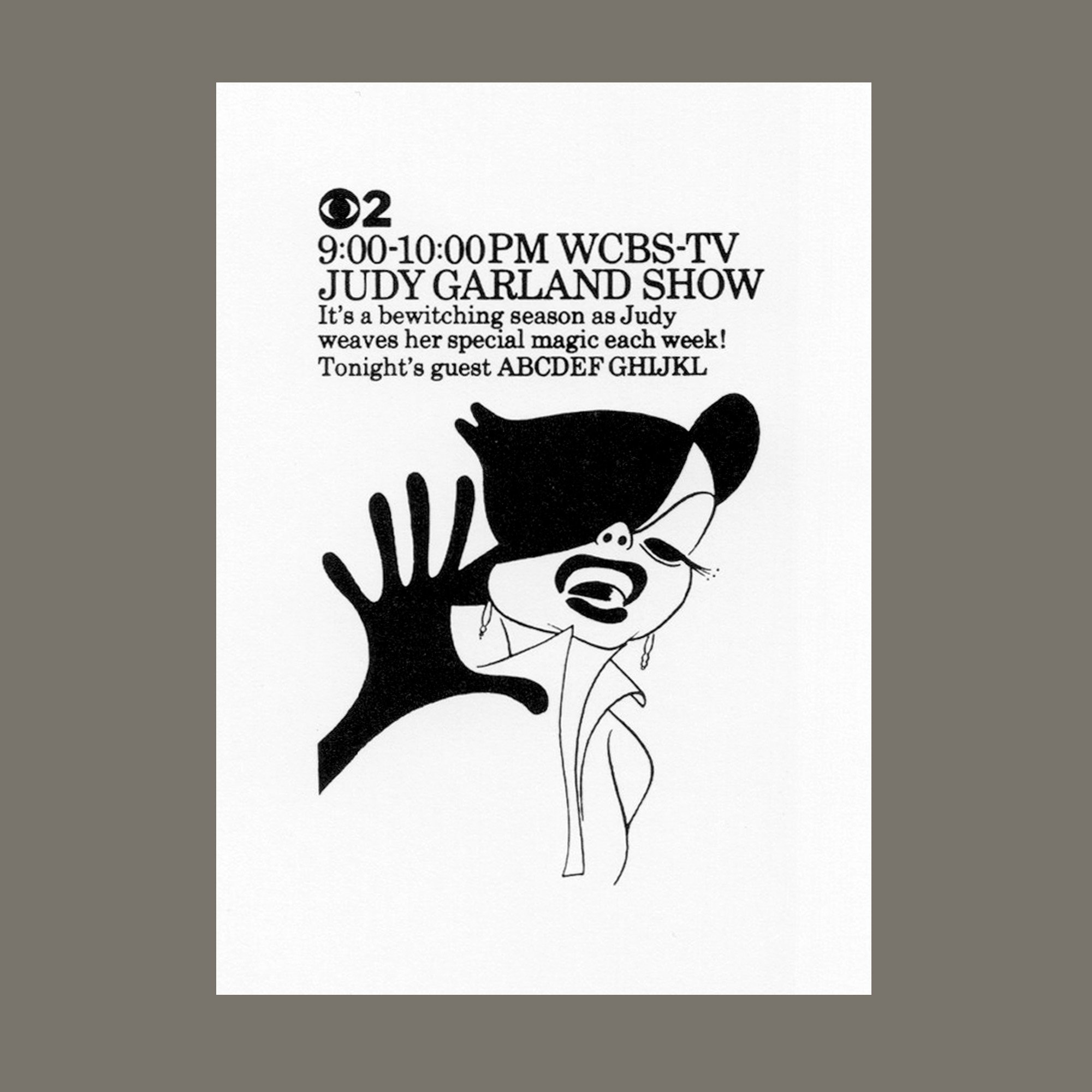
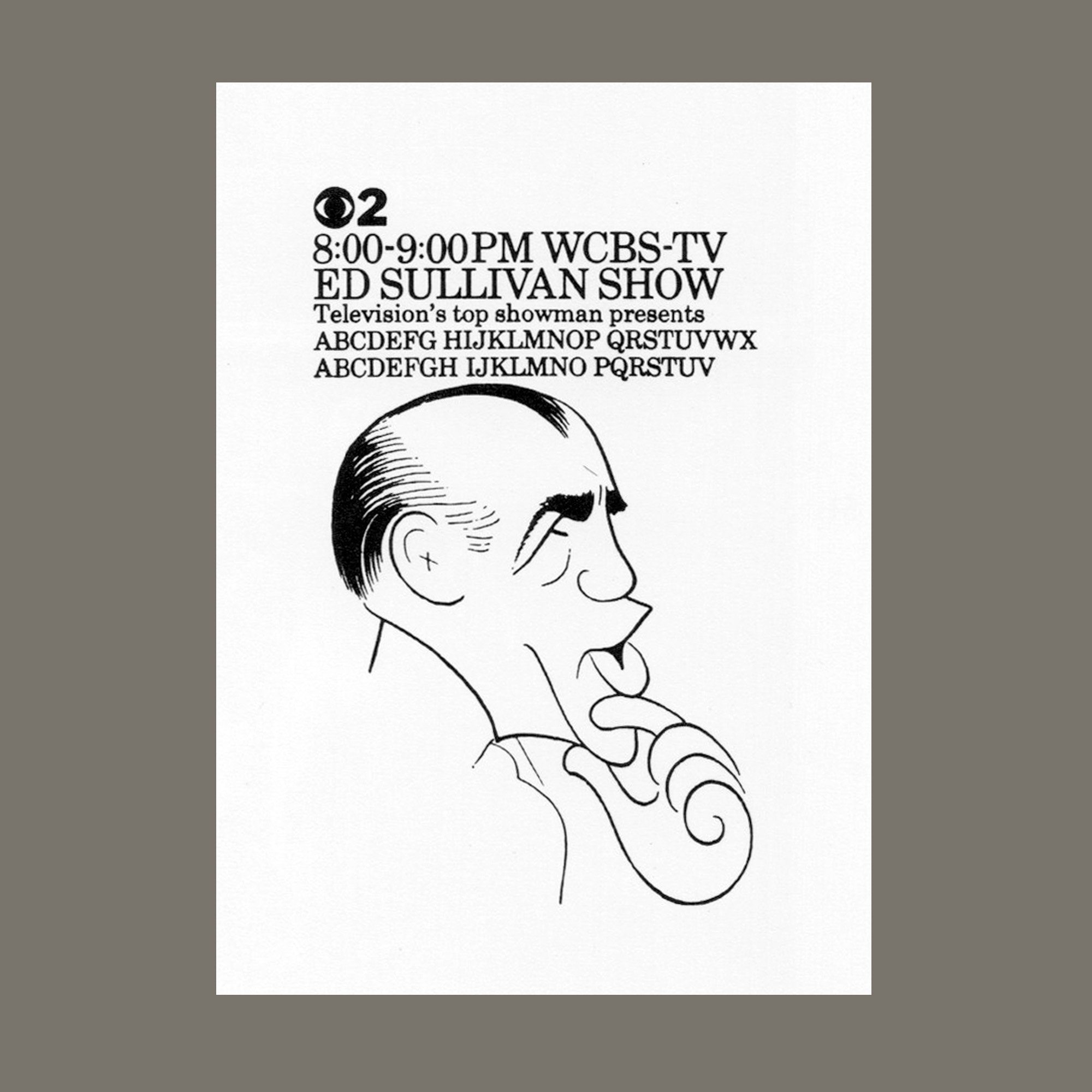
Small-space newspaper ads feature charming illustrations by Hirschfeld; 1962.
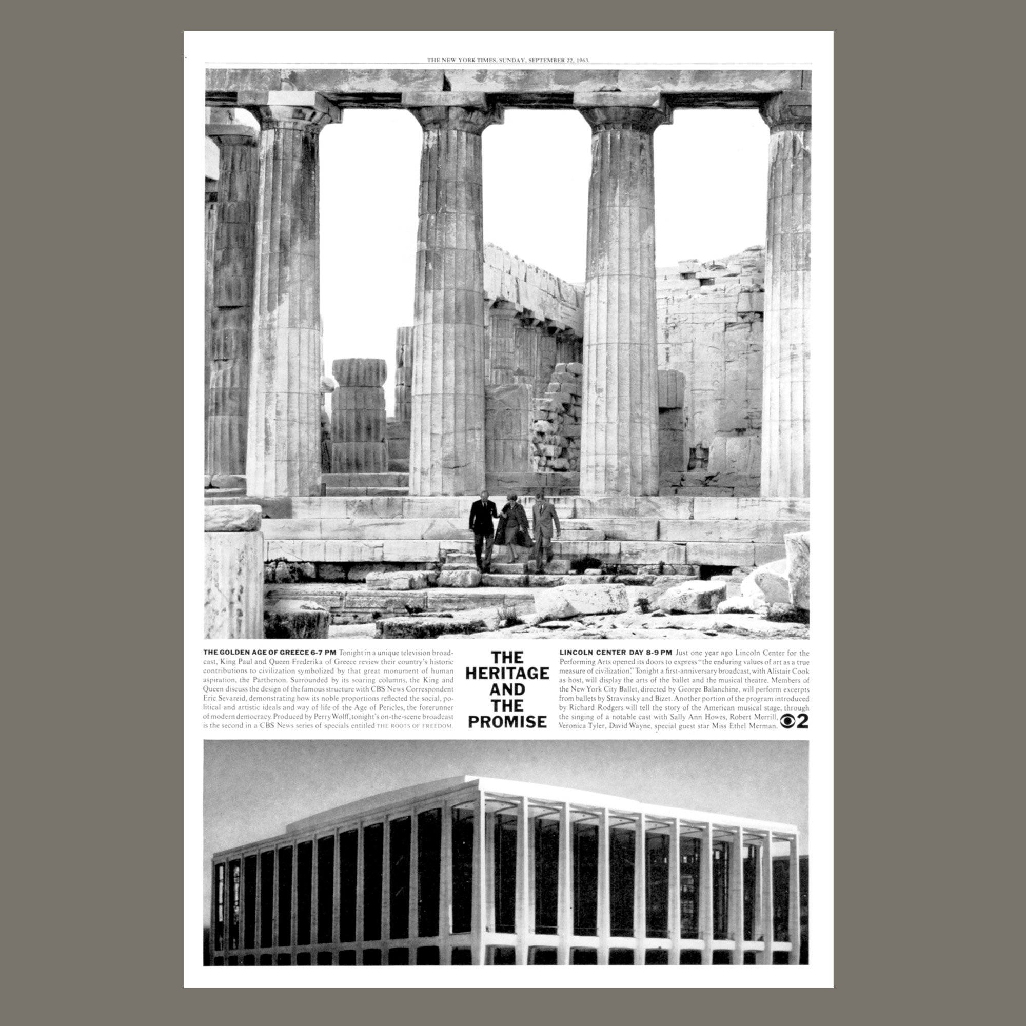
This one ad announced two CBS cultural programs scheduled for the same evening: a documentary on “The Golden Age of Greece” and a broadcast celebrating the first anniversary of Lincoln Center in New York. By juxtaposing an ancient Greek temple and the architecturally-similar Lincoln Center building, Dorfsman made a visual connection between the culture inherited from ancient Greece and the cultural offerings to come from Lincoln Center and CBS.

Dorfsman coined a name for the CBS Network News Team, “Worldwatchers,” and designed a symbol — a jigsawed globe resting in a newsman’s hands. The take-apart globe appeared in newspaper ads and on-air promotions, intimating that CBS could take apart the world’s news, study it, and put it back together for the viewer.

This ad for CBS Laboratories indicated their involvement in space explorations and the moon landings — specifically, NASA’s reliance on a picture readout system developed by CBS that brought back high-resolution photos from distances as much as 240,000 miles away.

A 1972 newspaper ad in the trade publication Variety — a light touch with the headline leads directly into statistical data about CBS’ ratings successes.
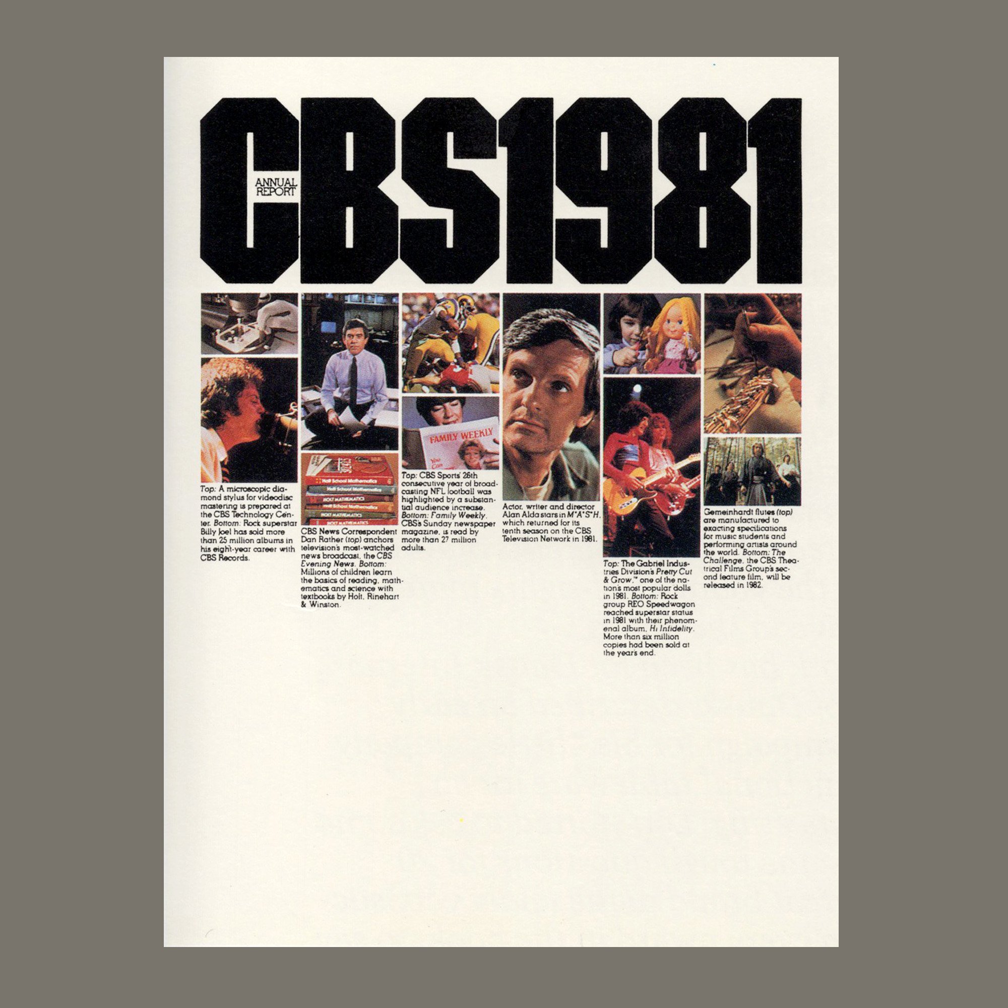
CBS Annual Report 1981: for this cover design, Dorfman created a table of contents of sorts, teasing portions of the interior content.