Willy Fleckhaus Revolutionizes Editorial Design
From magazines and newspapers to books and album covers, German art director Willy Fleckhaus (1925-1983) may have been the best editorial designer of all time. He's certainly been a source of admiration and inspiration throughout my career. Fleckhaus’s striking designs are energized by his expert use of the grid, his superb manipulation of white space, and his dynamic typographic compositions. To preserve and celebrate Fleckhaus' work, designer and author Carsten Wolff created the excellent online archive and forum "Fleckhaus Now," and I was honored to be asked to contribute the inaugural essay to the section called "Voices." Check it our here.
An excellent collection of Fleckhaus’ design work, and thoughtful examination of his life and work, is Design, Revolt, Rainbow, a beautifully-designed book by Hans-Michael Koetzle and Carsten Wolff.
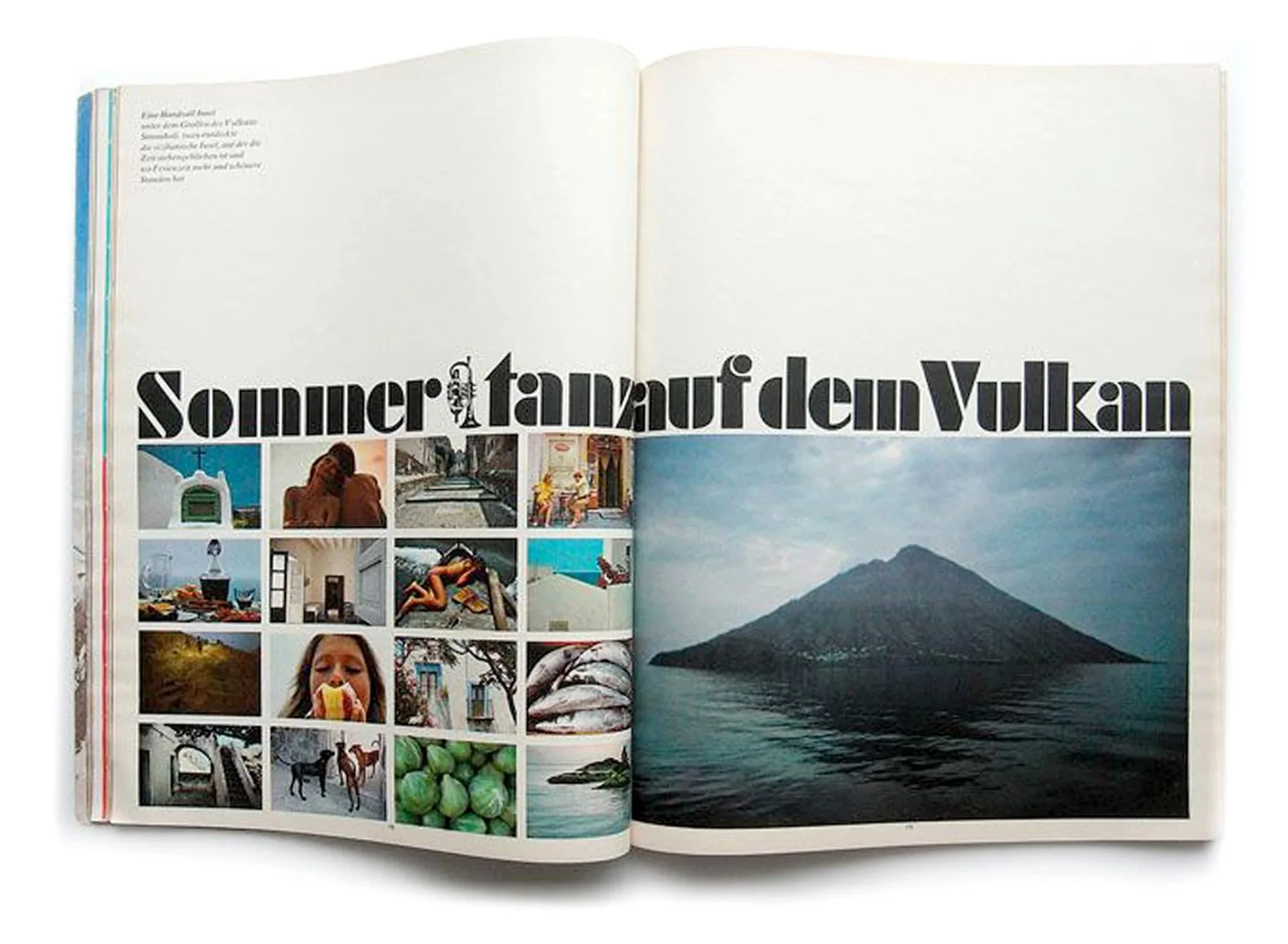
As art director of the magazine Twen (1959–1970), Fleckhaus created layouts that captured the spirit of the 1960s youth revolution. The magazine combined bold photography, sexuality, politics, and experimental design—unusual for conservative postwar Germany.
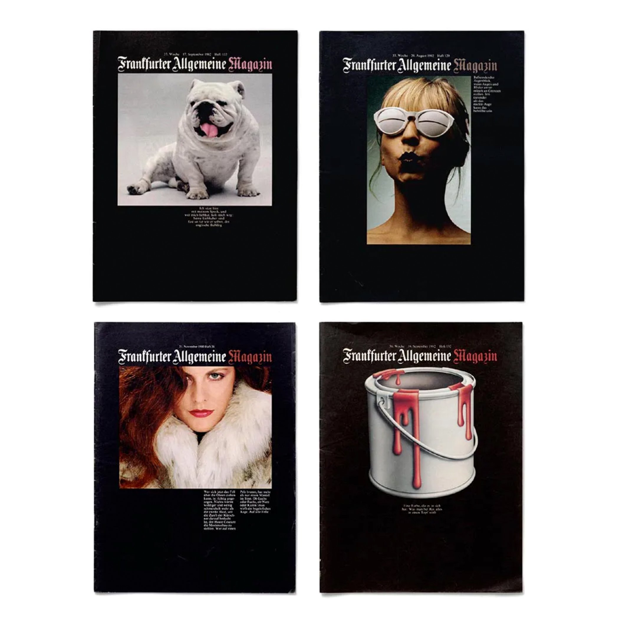
(Left) In the early 1980s, Fleckhaus designed Frankfurter Allgemeine Magazin, a weekly supplement to a German tabloid newspaper. Fleckhaus created a signature look for the covers by utilizing black backgrounds and restrained typography.
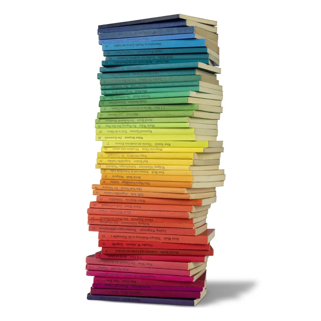
(Far left) Beginning in 1971, Fleckhaus designed this book series for the German publishing house Suhrkamp. Eventually known as “the Rainbow Series,” the cover design system featured no photography or illustrations, but created a unique look with simple typography and dozens of solid-colored backgrounds.
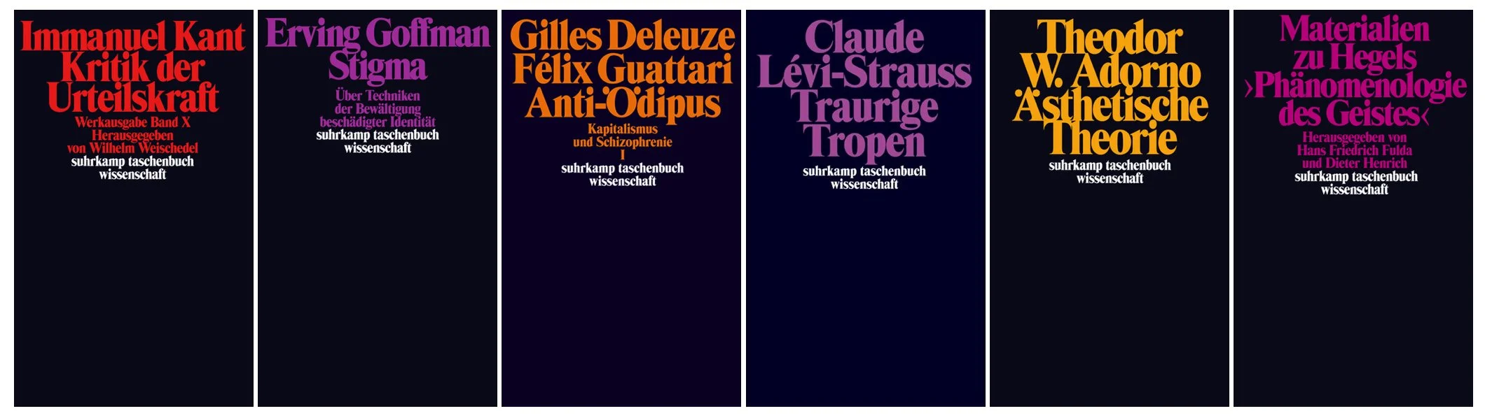
This book series from Suhrkamp omits cover art and focuses on colored type on black backgrounds, creating a distinctive and unified visual identity in the process.
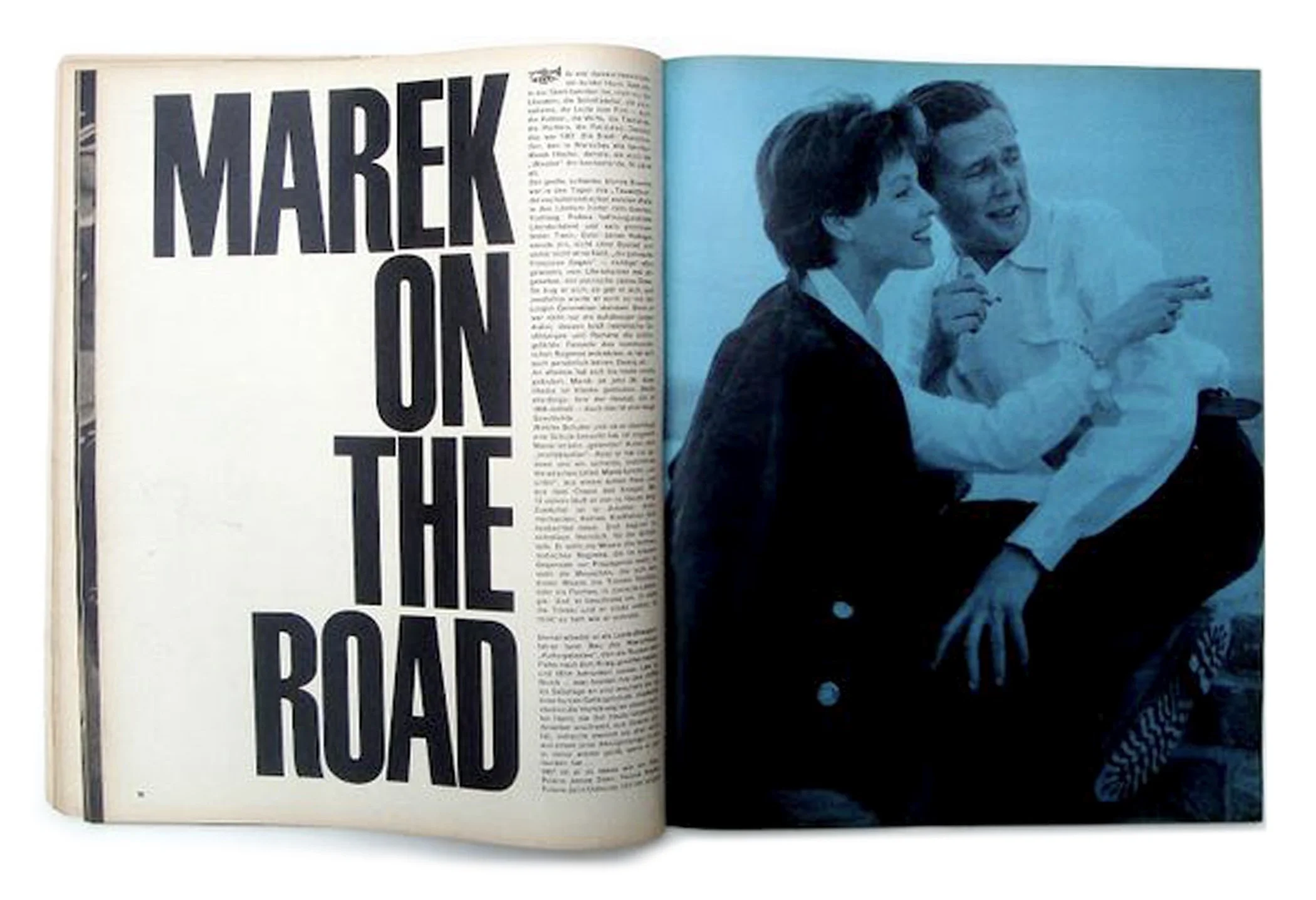
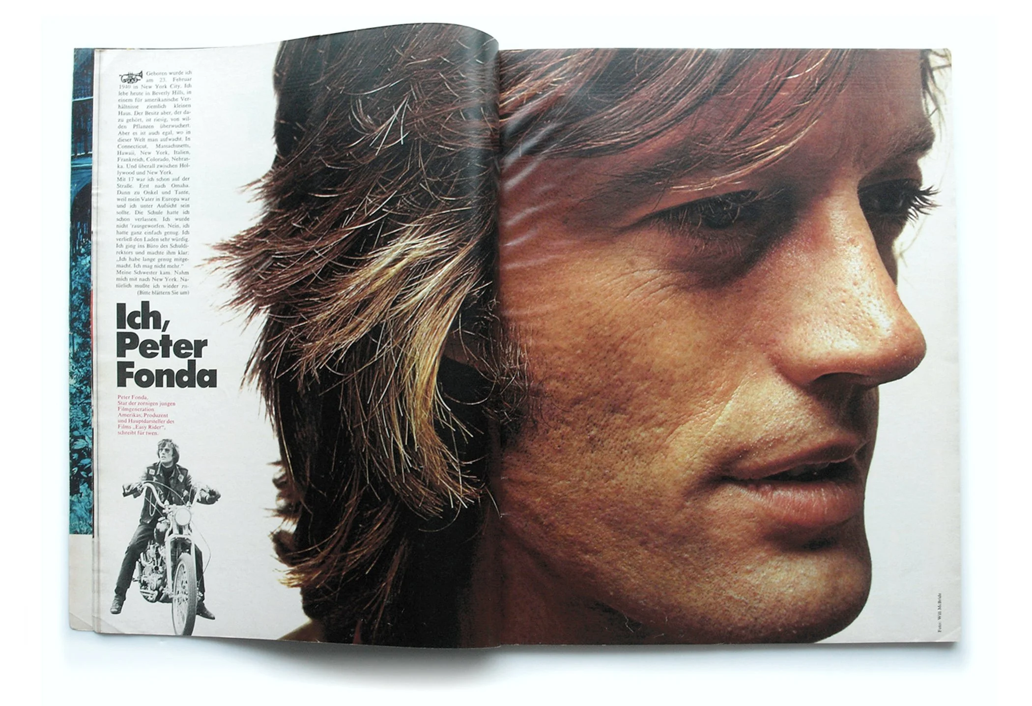
Ample white space and dramatic contrasts of scale were two elements Fleckhaus used masterfully to create arresting layouts for Twen Magazine.
Back to Index of Journal Stories