Learning from Lou Dorfsman:
The Modernist Who Redesigned CBS
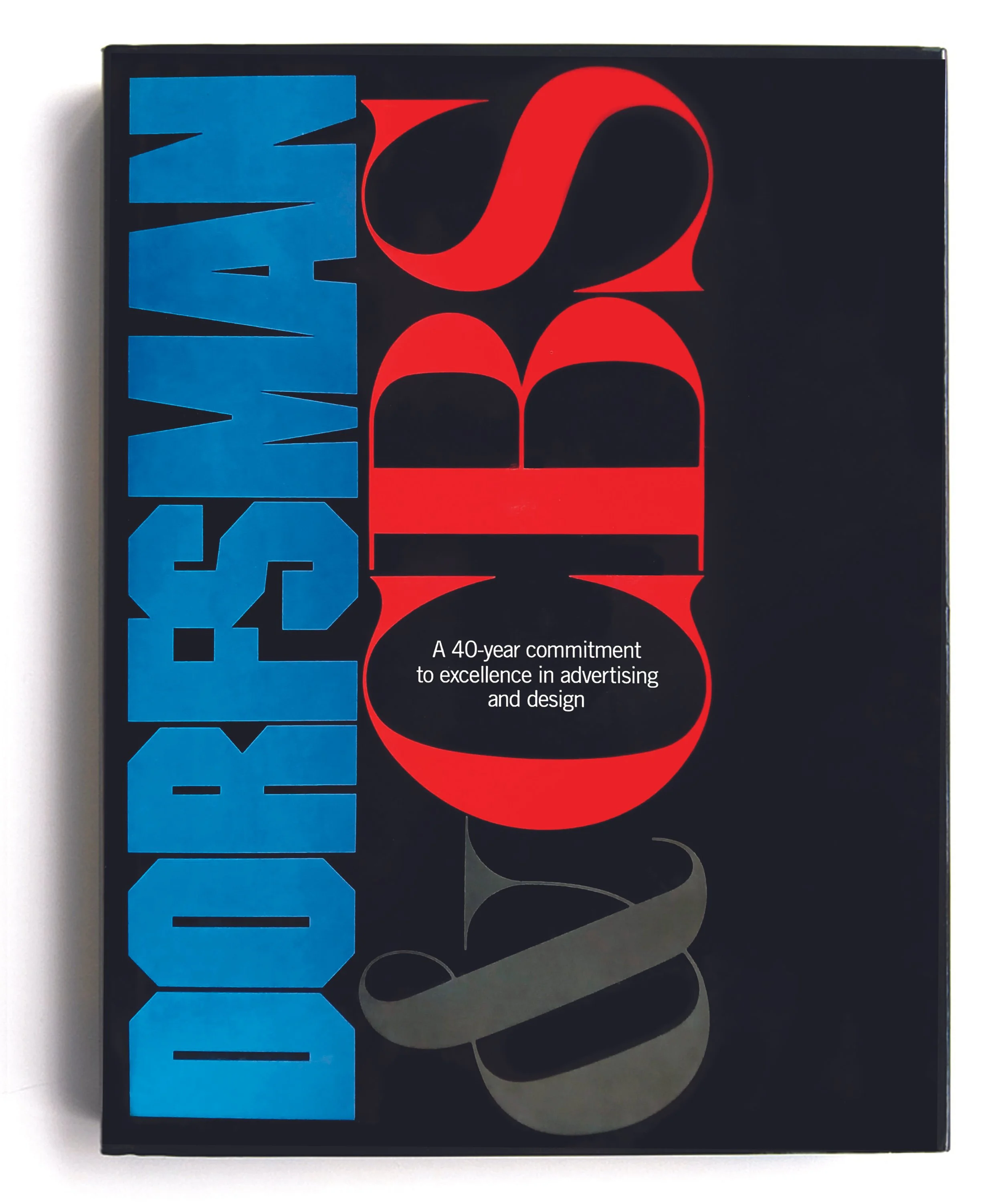
One of my all-time favorite design books, Dorfsman & CBS, is a superlative education in typography and the handling of two-dimensional space.
Lou Dorfsman worked at CBS for forty years in the mid-20th century, functioning as their de facto creative director before the term was in common use. He developed an entire visual language for the network, and used it to design everything from the cups in the CBS cafeteria to print advertising, on-air motion graphics, and signage systems for their Manhattan headquarters.
This impressive monograph beautifully showcases Dorfsman’s powerful work, which still looks modern decades later. First published in 1987, Dorfsman & CBS is a joy to experience and I learn something new every time I open the cover.
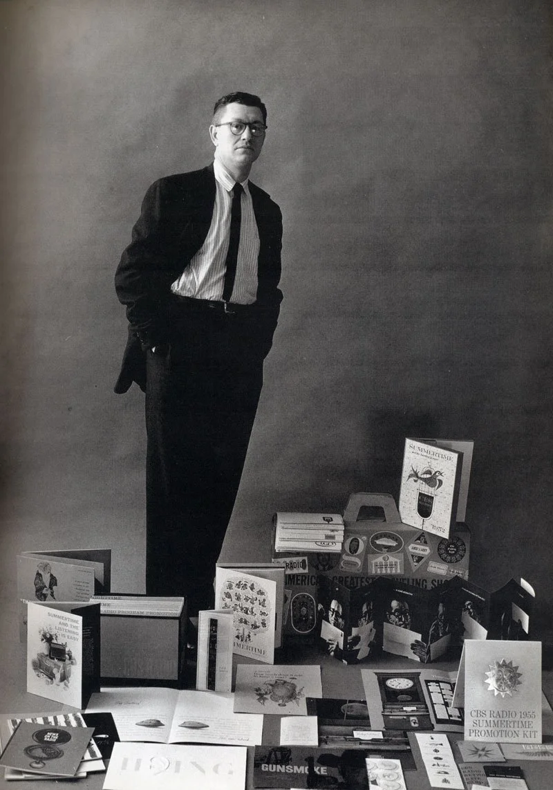
Lou Dorfsman began designing newspaper ads for CBS Radio stations during the 1950s. Eventually he became the creative director for the national television network throughout the 1960s and 1970s. Pictured above is a1955 trade publicity photo of Lou Dorfsman surrounded by some of his designs for CBS.
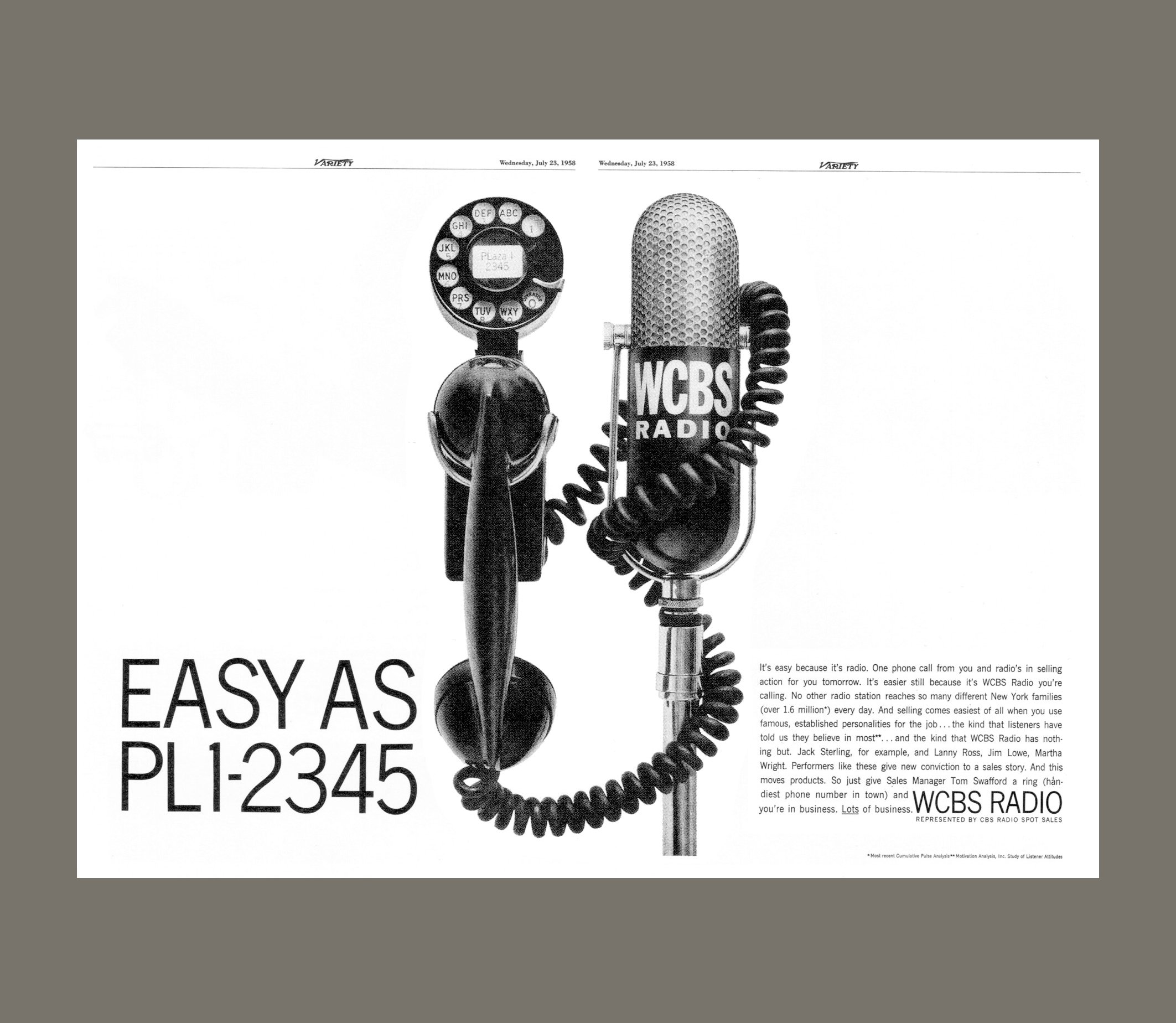
This 1958 advertisement for the trade publication Variety linked the shape of a radio microphone with the shape of a telephone, underscoring the message that radio spots could be booked over the phone. Wrapping the phone cord around the microphone was a genius finishing touch.

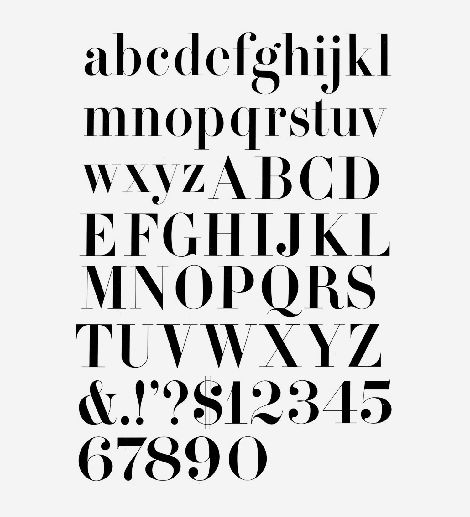
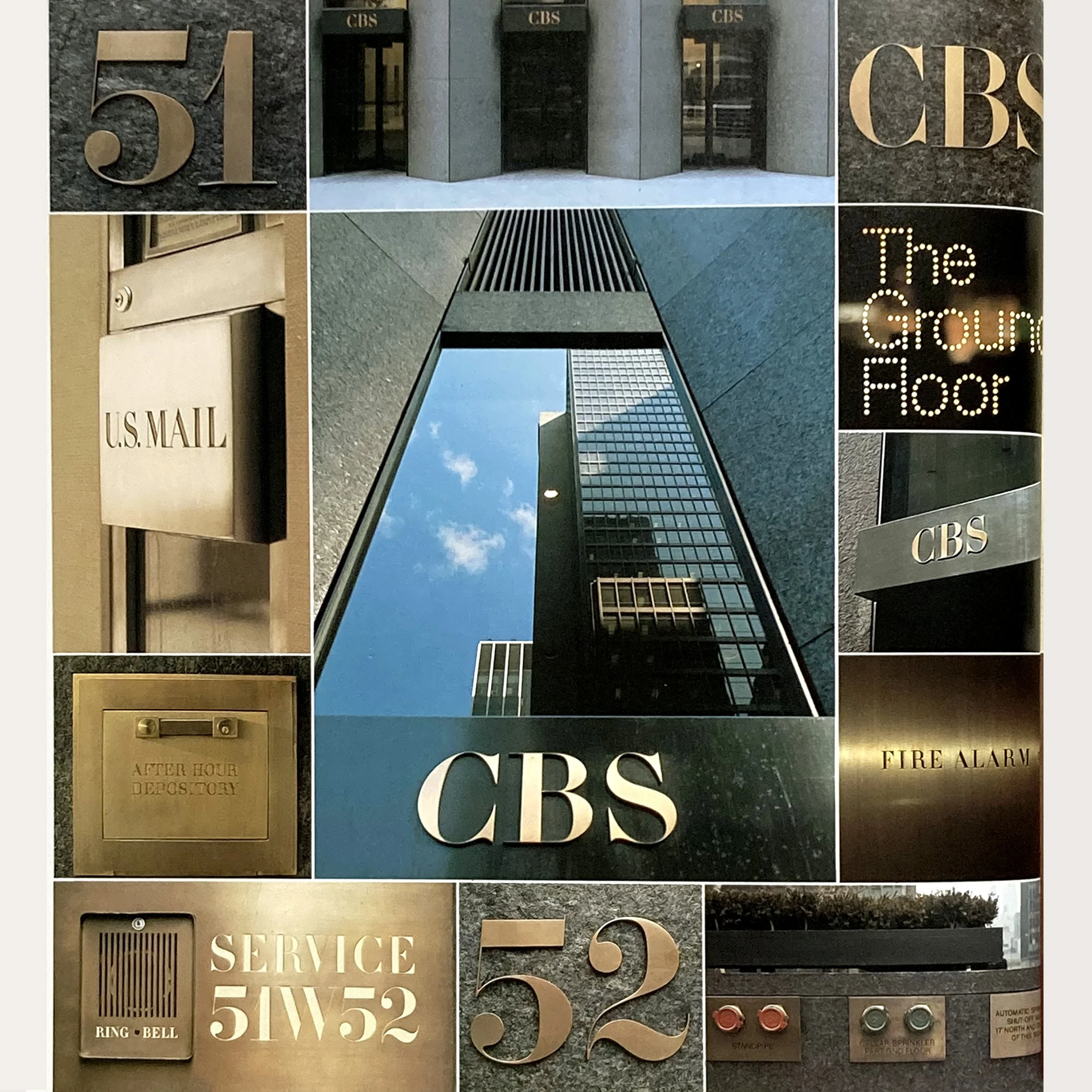
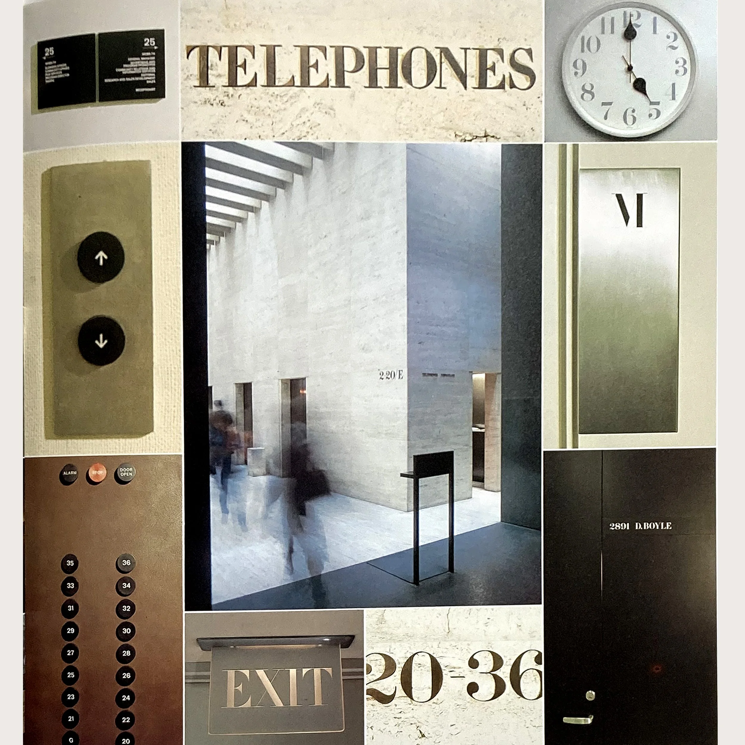
In the early 1960s, Dorfsman worked with type designers to develop the beautiful CBS Didone corporate font that was used on signage and other materials throughout the network’s headquarters building in New York.
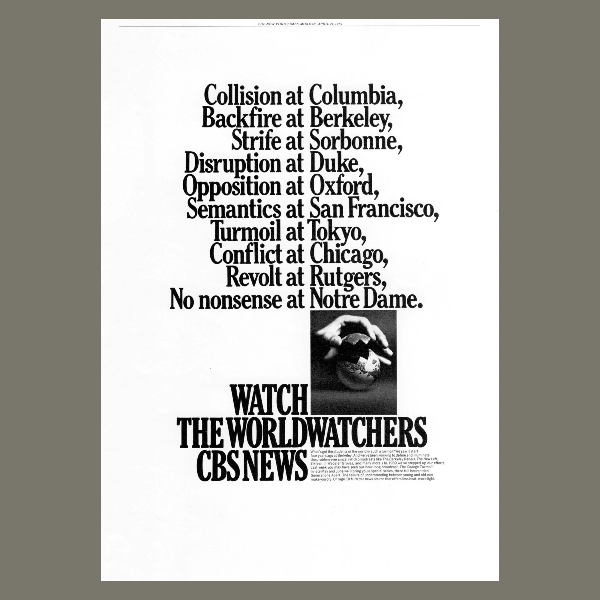
Dorfsman coined a name for the CBS Network News Team, “Worldwatchers,” and designed a symbol — a jigsawed globe resting in a newsman’s hands. The take-apart globe appeared in newspaper ads and on-air promotions, intimating that CBS could take apart the world’s news, study it, and put it back together for the viewer’s understanding.
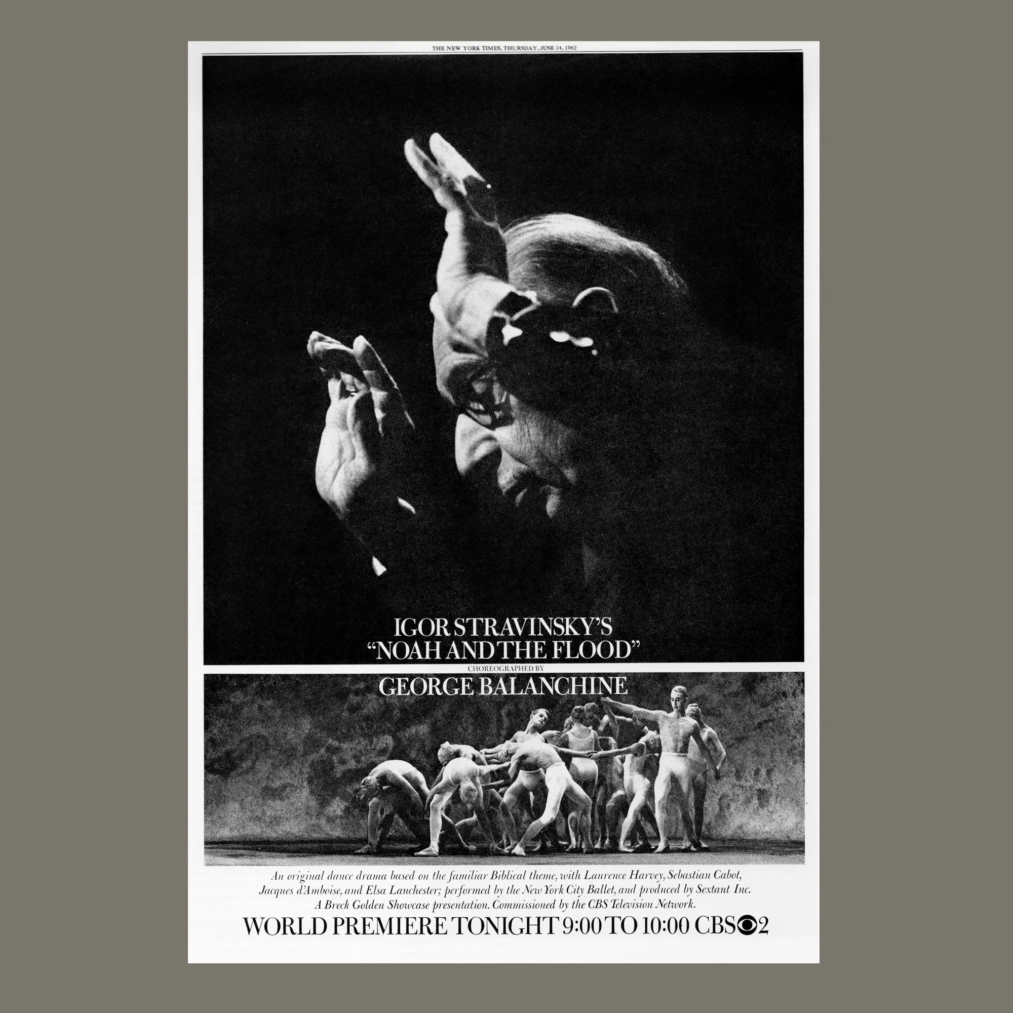
The poster-style treatment of this 1962 newspaper ad implied an event of artistic significance. The contrast in size and scale of the juxtaposed photos heightened the drama: an example of deft maneuvers with stock promotional photos. (New York Times 1962)
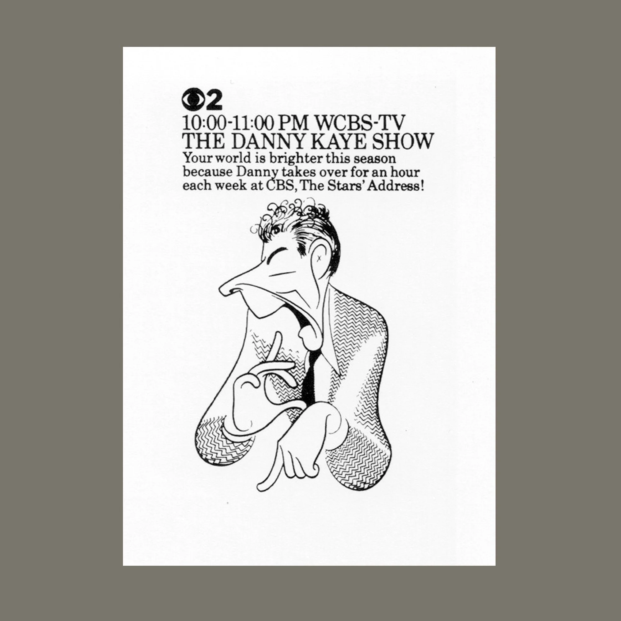
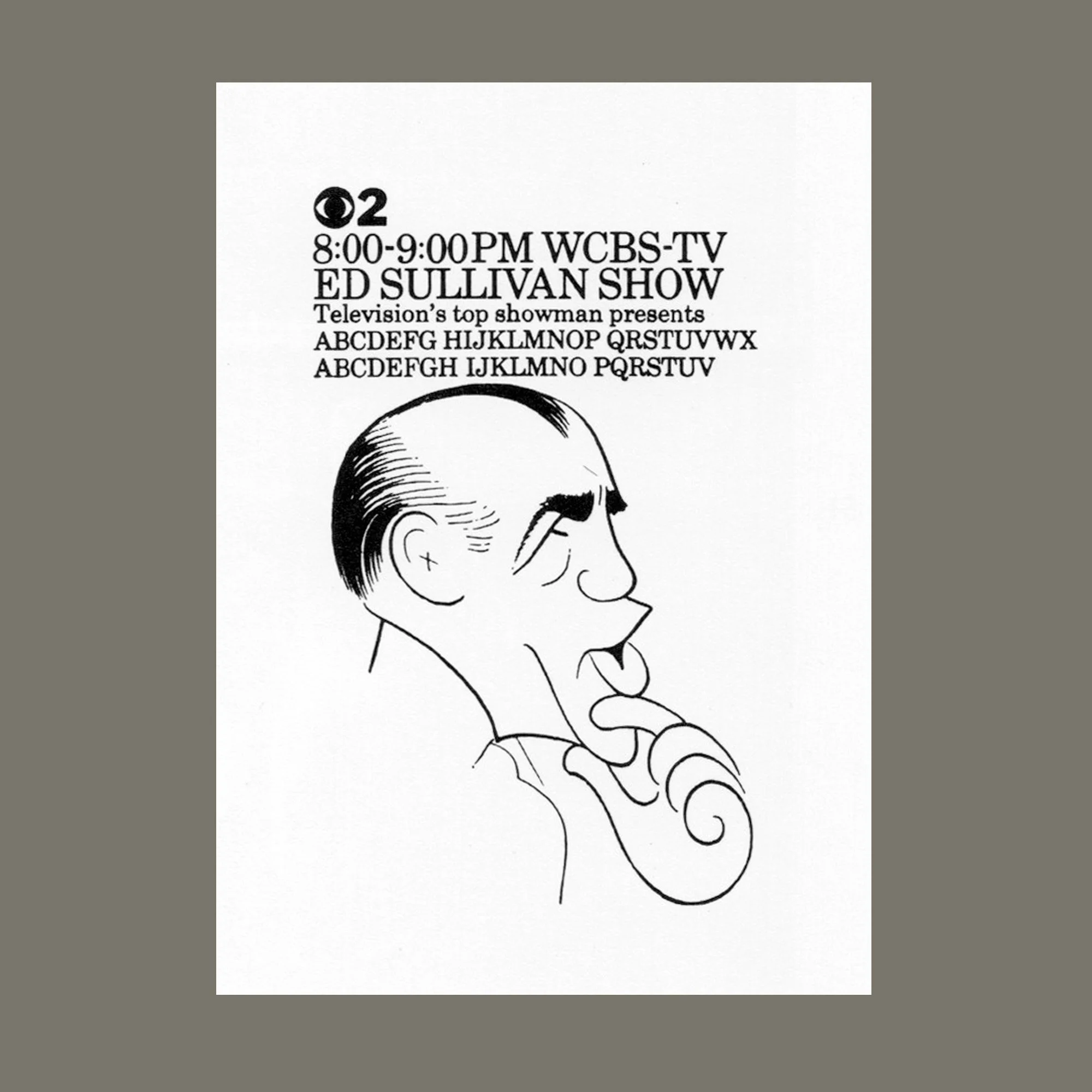
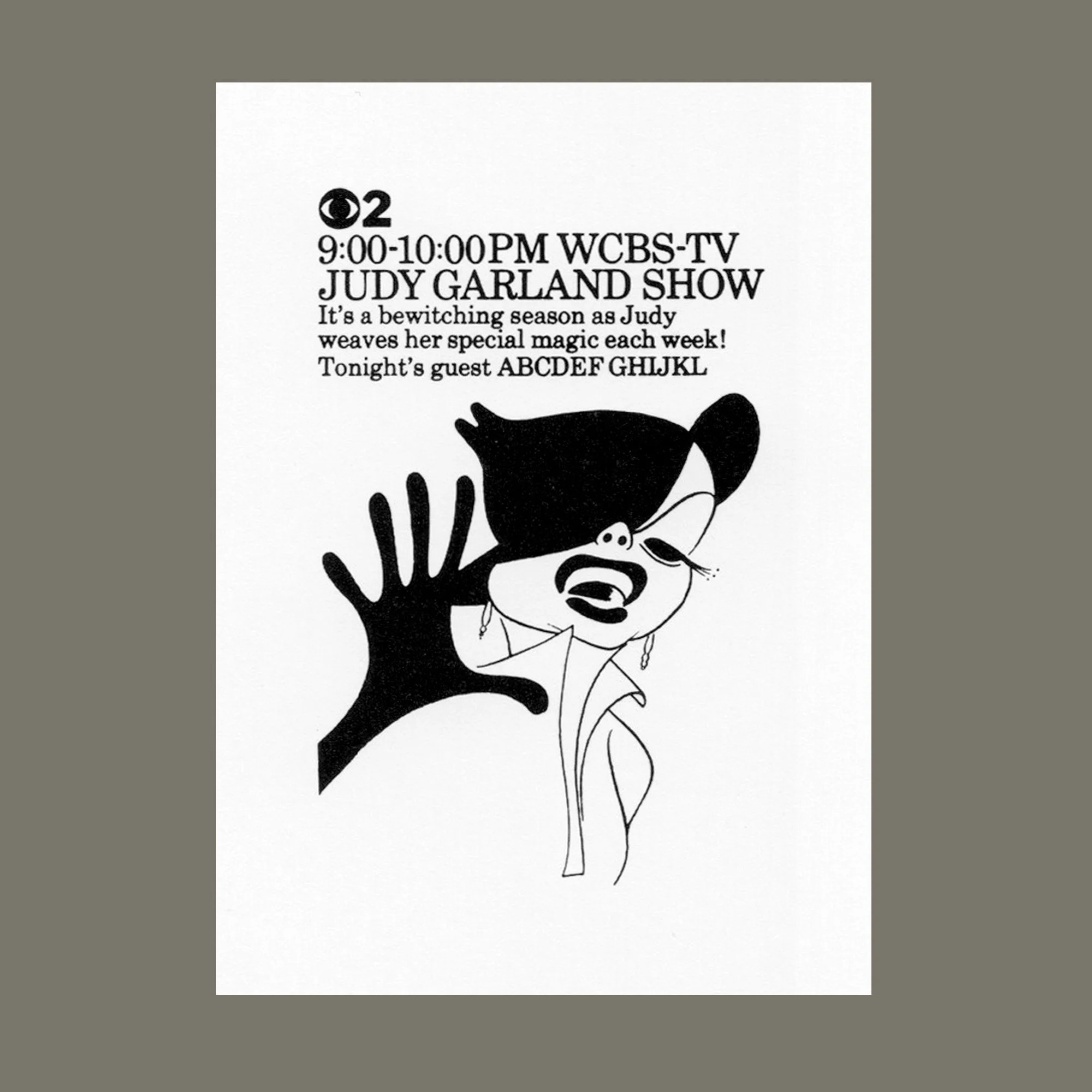
Small-space newspaper ads feature charming illustrations by Hirschfeld, commissioned by Dorfsman for CBS; 1962.
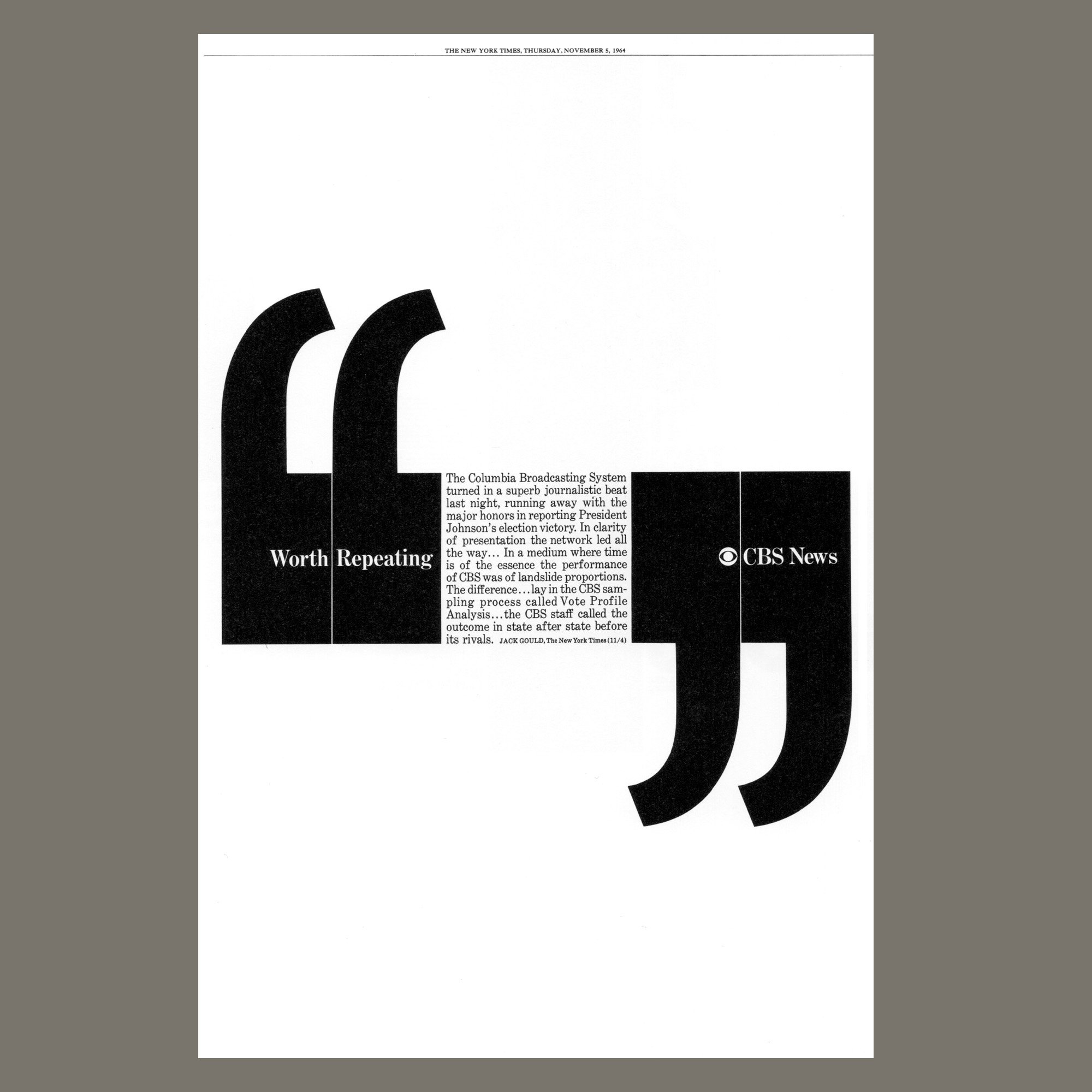
Type becomes illustration in this eye-catching newspaper advertisement from 1964. A glowing review of CBS’s election-night news coverage is highlighted with massive quotation marks… another example of Dorfsman’s use of dramatic contrasts in scale and skillful distribution of white space. (New York Times 1964)
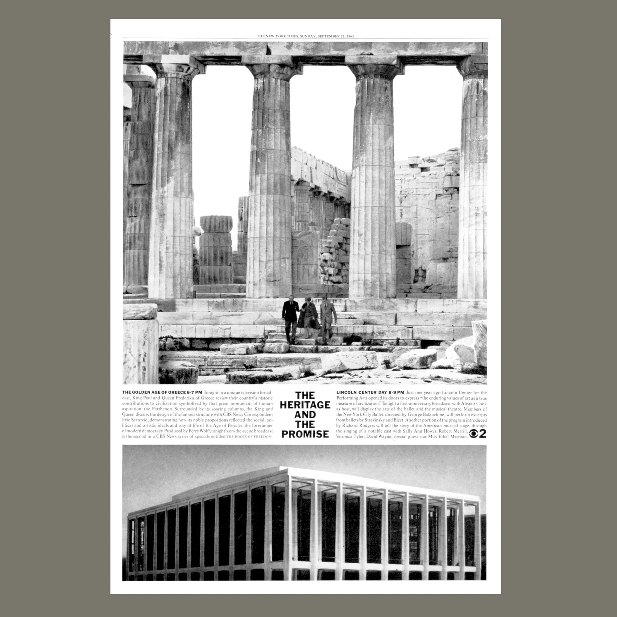
This one ad announced two CBS cultural programs scheduled for the same evening: a documentary on “The Golden Age of Greece” and a broadcast celebrating the first anniversary of Lincoln Center in New York. By juxtaposing an ancient Greek temple and the architecturally-similar Lincoln Center building, Dorfsman made a visual connection between the culture inherited from ancient Greece and the cultural offerings to come from Lincoln Center and CBS.
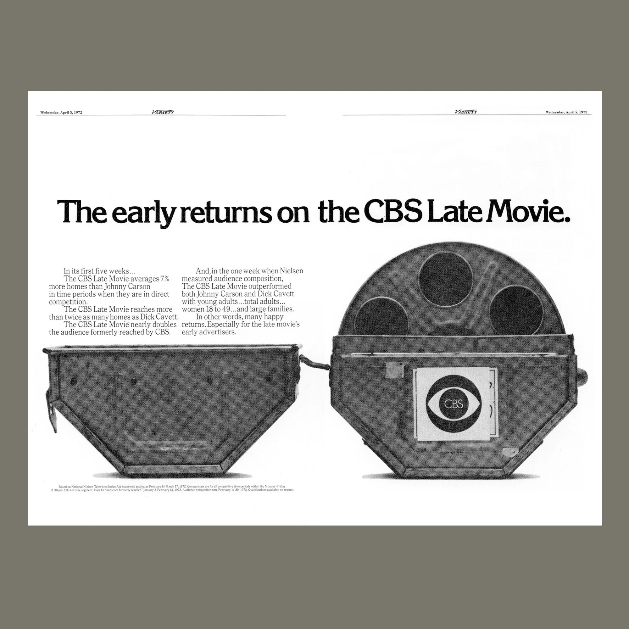
How to instantly wed the ideas of movies and the CBS television network? This smart solution delivers a visual that fuses the two ideas in the form of a film canister labeled with the CBS logo. Appearing in a 1972 issue of the trade publication Variety, this message targets potential advertisers with statistical data about the ratings successes of CBS Late Movies.
Back to Index of Journal Stories