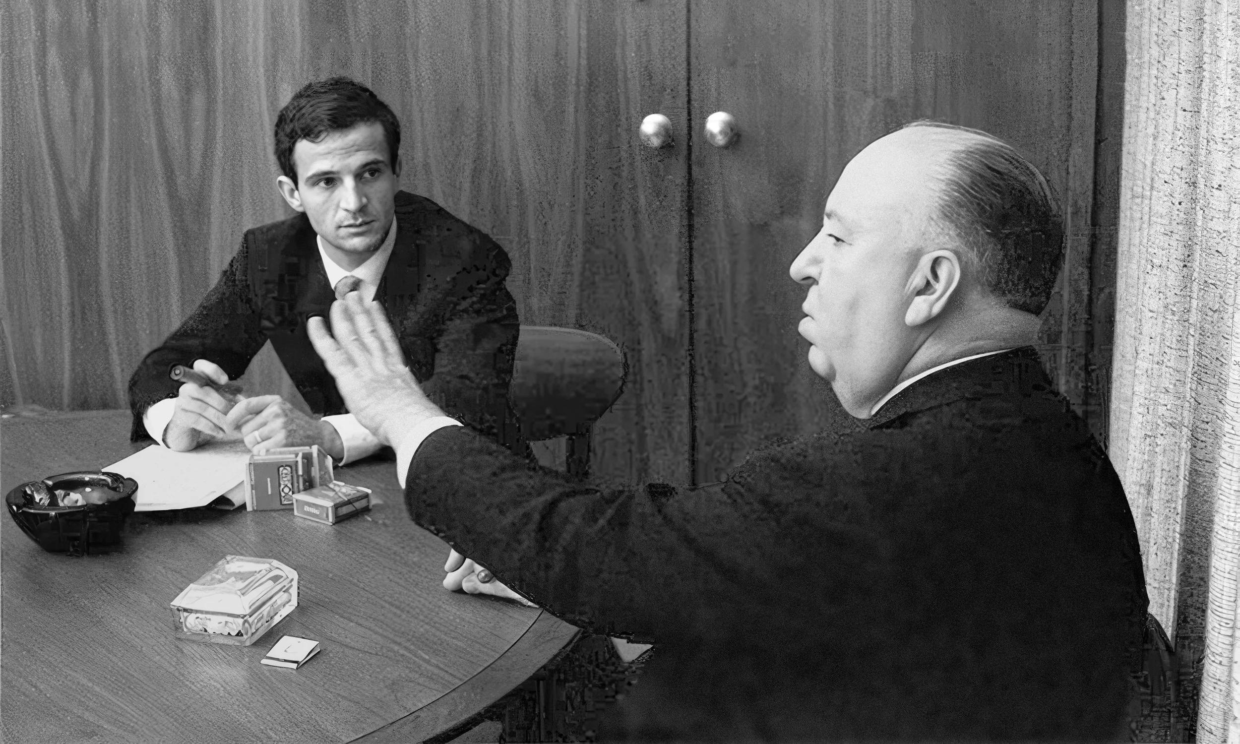
François Truffaut and Alfred Hitchcock in 1962. (Photo by Philippe Halsman)
Hitchcock / Truffaut: How To Design a Brilliant Book Cover (and How Not To).
Hitchcock/Truffaut is a 1966 book based on a historic series of interviews between two cinematic legends: François Truffaut and Alfred Hitchcock. For this marathon interview, Truffaut flew from Paris to Los Angeles in 1962, where the two directors spent an entire week sequestered in a room at Universal Studios, talking extensively about Hitchcock’s movies and filmmaking in general.
A book reviewer on Good Reads says, “it’s difficult to think of a more informative or entertaining introduction to Hitchcock’s art, interests, and peculiar sense of humor. The book is a storehouse of insight and witticism, including the master’s impressions of a classic like Rear Window, his technical insight into Psycho’s shower scene, and his ruminations on flops such as Under Capricorn. This is one of the most delightful film books in print.”
In 1985, Truffaut released a revised edition of the book with a new preface and a new final chapter on Hitchcock’s later films. (The book and its interviews were later made into a fascinating documentary with the same title, which I encourage you to watch if you have the chance.)
Let’s take a look at the design of the two book covers below, which share many elements but could not be more different in their results.
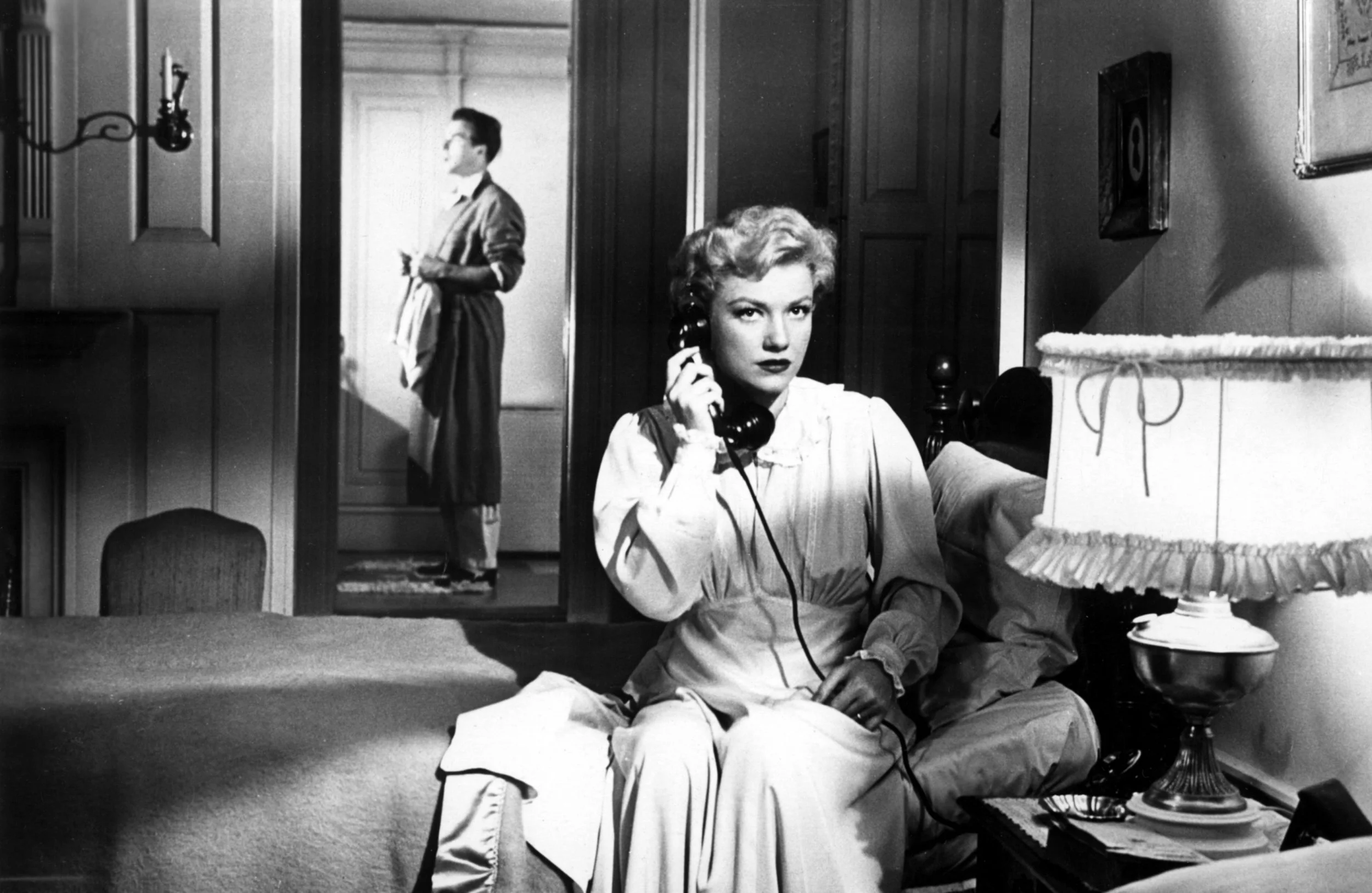
I Confess, 1953
Notorious, 1946
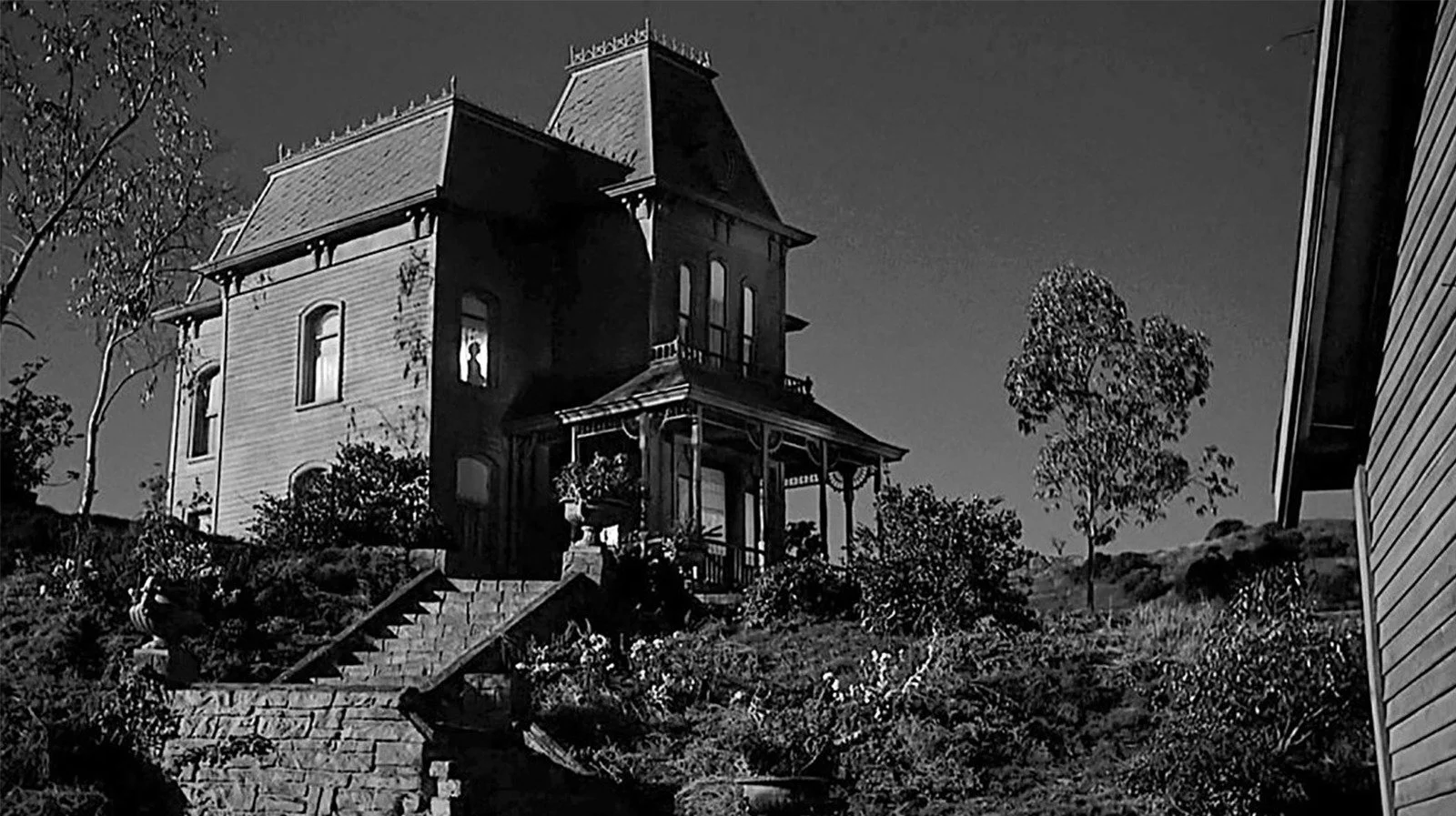
Psycho, 1960
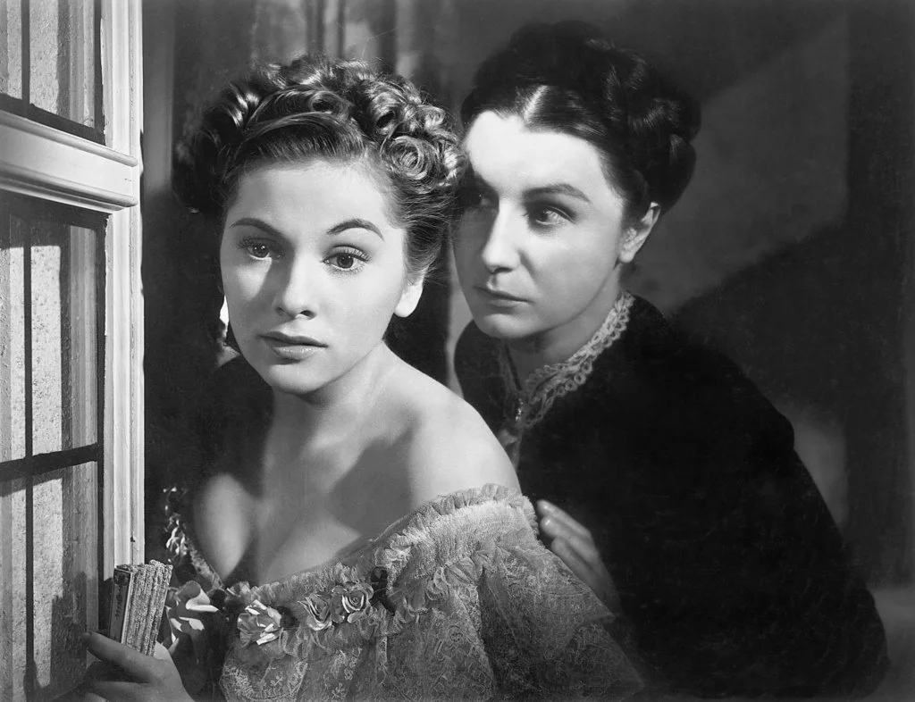
Rebecca, 1940
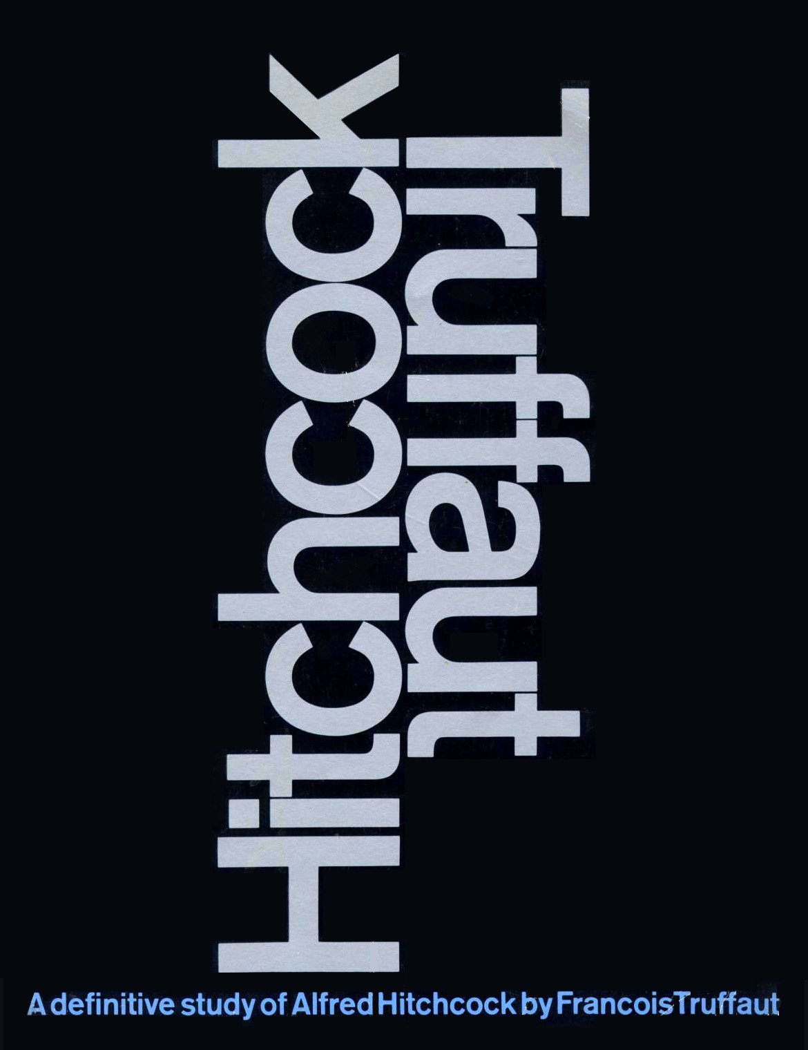
The Original Book Cover
The 1966 book cover is a near-perfect design. It exemplifies the Modernist pursuit of “intellectual elegance”: a design that eliminates the superfluous, allowing the essential to shine more brightly.
In this composition, skillfully-kerned type is dramatically enlarged and arranged “back to back,” symbolizing a “meeting of the minds.” This design is not just beautiful, it’s also an accurate distillation of the book’s content: an intimate conversation between two people. The achromatic color palette may be a sly reference to Hitchcock’s superlative black and white cinematography in his early films like Notorious, Rebecca, and Psycho. A small subtitle is deliberately minimized and isolated, so as not to detract attention from the beautiful typographic composition that is the focal point of this design.
Another hallmark of Modernist design thinking — restraint — is demonstrated by what is not present in this book cover design. An easy solution would have been to include a cliched photograph of a film projector or a director’s chair. And imagine the temptation to add still images from Hitchcock’s visually-stunning films. Some of the most iconic scenes in cinema history were Hitchcock creations, from movies like Rear Window, Vertigo, and North By Northwest. It’s easy to imagine a publisher or marketing department pushing to add photos from famous films to potentially increase the book’s sales.
But the designer’s restraint puts the focus on a few crucial, beautifully-arranged elements: one typeface, two type sizes, two colors, and one bold idea. The resulting design is a powerful, evocative triumph that literally cannot be improved.

The Unfortunate Revision
Which brings us to the second cover design, created for the 1985 revised edition of the same book.
What a disappointment.
Unnecessary effects clutter and muddy the elegantly simple original design. A garish orange-to-yellow gradient blend is pasted into the large type. (Why?) A drop shadow is clumsily added, going off in two different directions at the same time.
What was once elegantly simple and direct is now busy, complicated and hard to read.
Why were these changes made? I’m guessing the publishers felt a need to update the original design to make it clear that the revised edition was something new. But that could have been handled with more discipline and subtlety, achieving a much better result. For example, something as simple as reversing the color palette (black type on white background) would have created a new look while retaining the simplicity of the original design that was so beautiful.

Less Really is More
This case study perfectly demonstrates the power of restraint in design.
Inexperienced designers consider a project finished when they can’t think of anything else to add.
Masterful designers consider a project finished when there is nothing left to take away.
Back to Index of Journal Stories