Tampa Museum of Art
Comprehensive Visual Identity
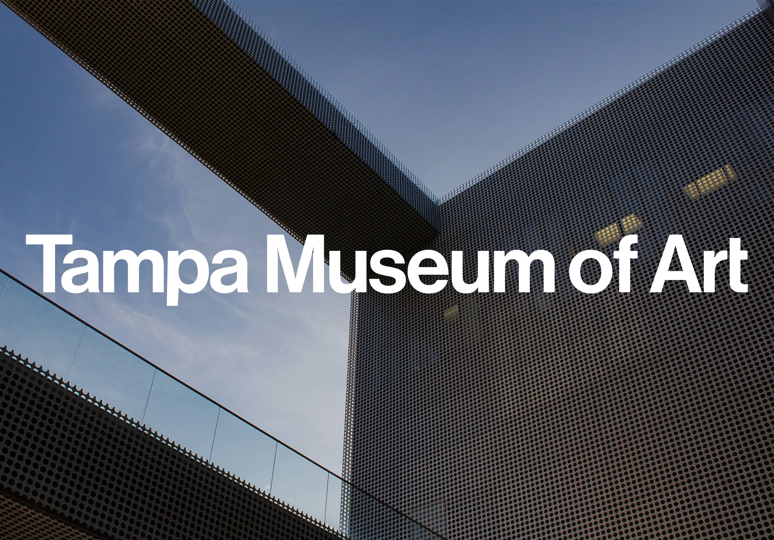
The foundation of this visual branding system is a frame-like symbol based on the museum’s architecture — specifically the facade’s distinctive square void. The mark we designed can be thought of as a frame, a window, or a doorway, all leading to new experiences with art.
The Tampa Museum of Art’s collections span thousands of years, from the Classical sculptures of ancient Greece to street photography taken in the 2000’s. The visual branding lets the artworks take center stage, as the Modernist typography and color-coded publications guide visitors through the museum’s exhibitions and experiences.
Project scope: Comprehensive branding system including logo, typography system, advertising and collateral publications
Typefaces: Neue Haas Grotesk family by Richard Turley

Architecture Becomes Identity
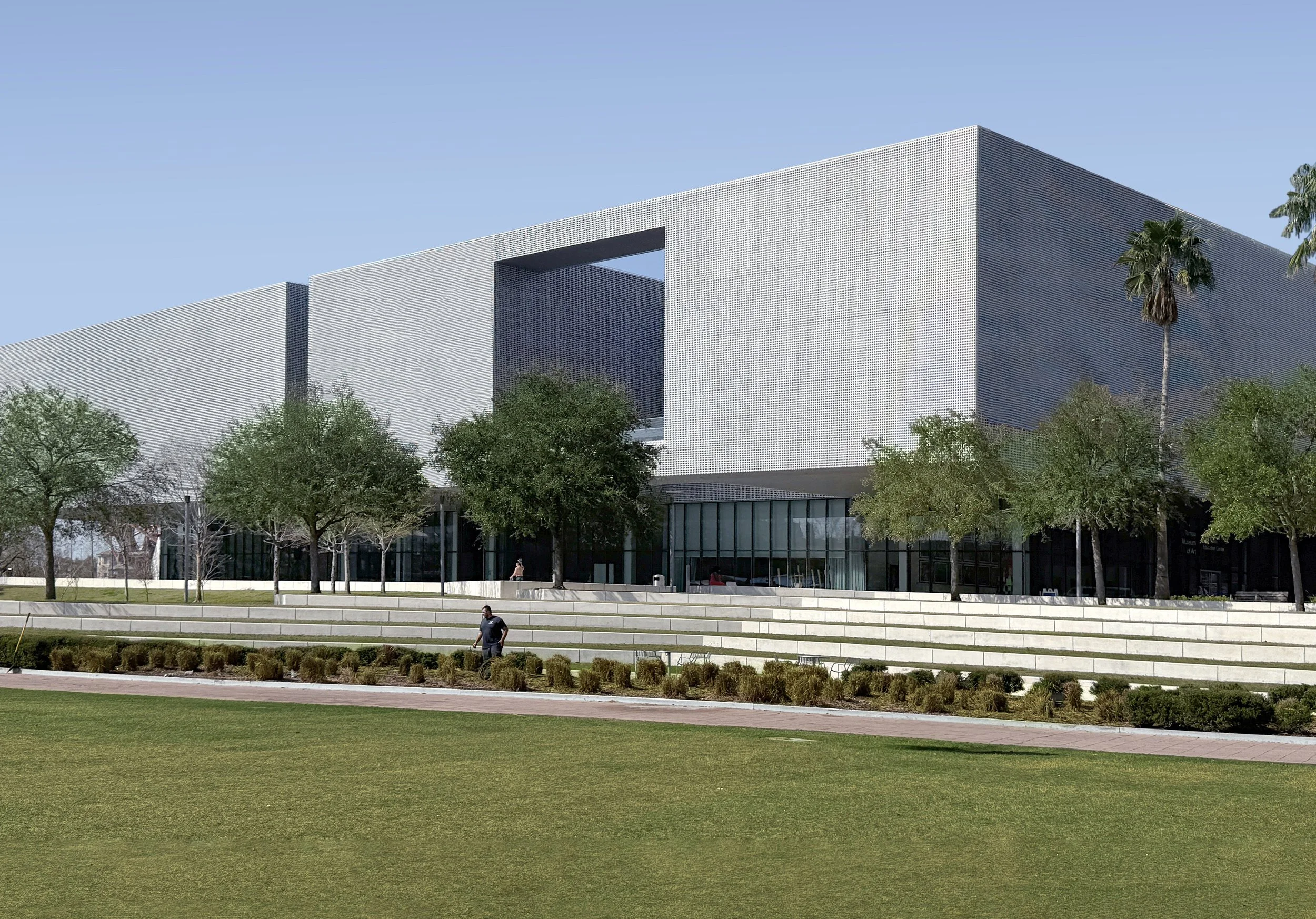
In 2006, Modernist architect Stanley Saitowitz created a striking new home for the Tampa Museum of Art. The intriguing square “void” in the museum’s geometric structure provided the inspiration for the mark we created to anchor the new visual identity. Symbolizing an artwork’s frame or a portal to new ways of seeing, the simple but dynamic mark is an abstraction of the museum’s architecture and an invitation to experience the artworks inside.


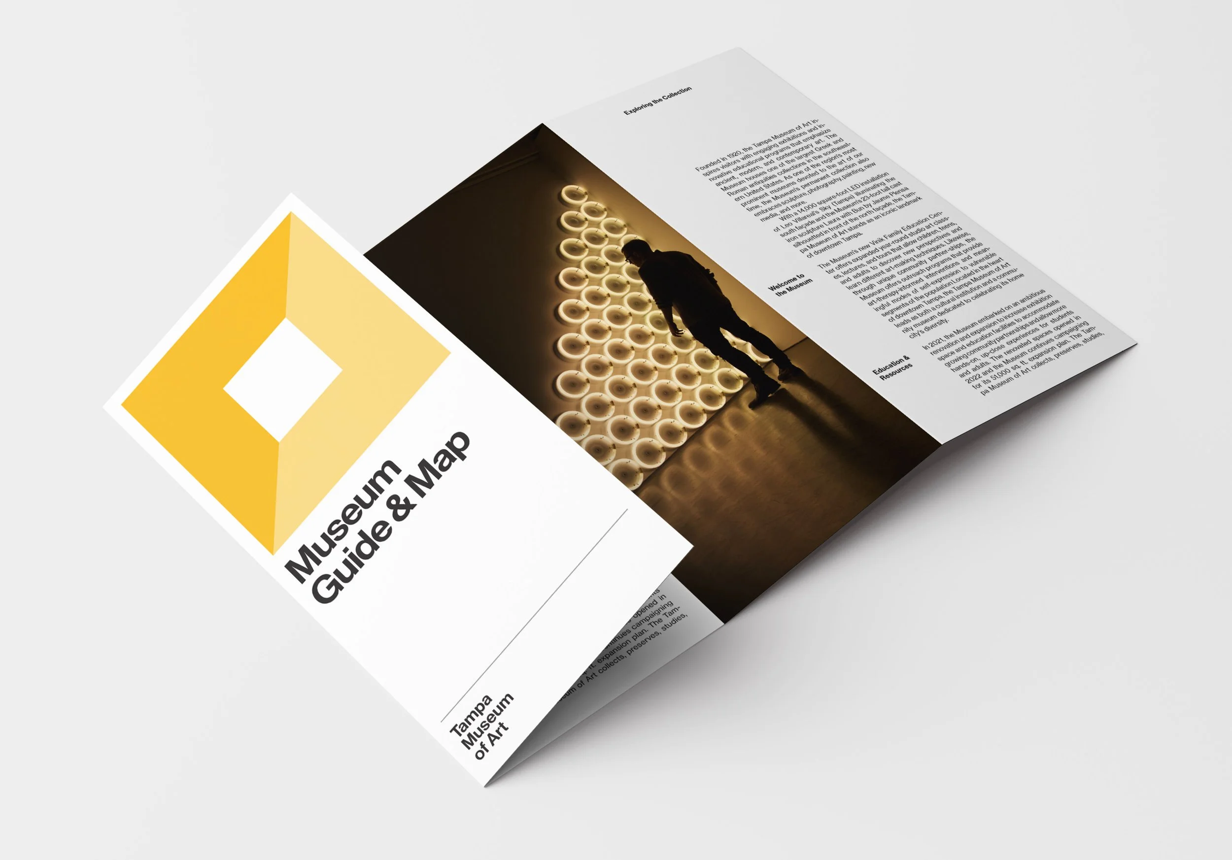
A series of uniformly-designed brochures introduces visitors to the museum’s programs and departments.
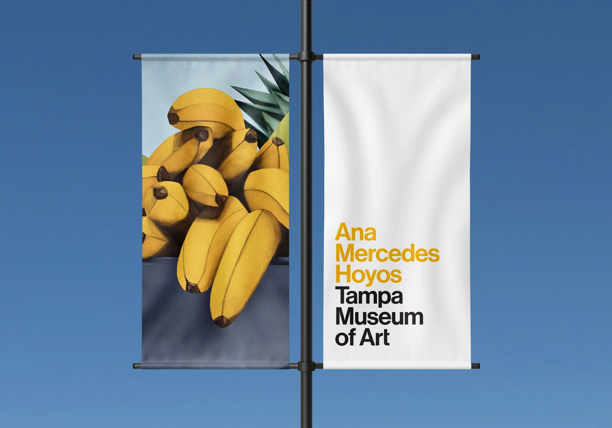
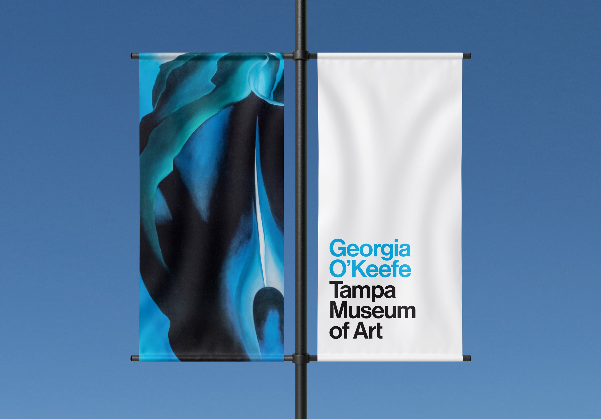
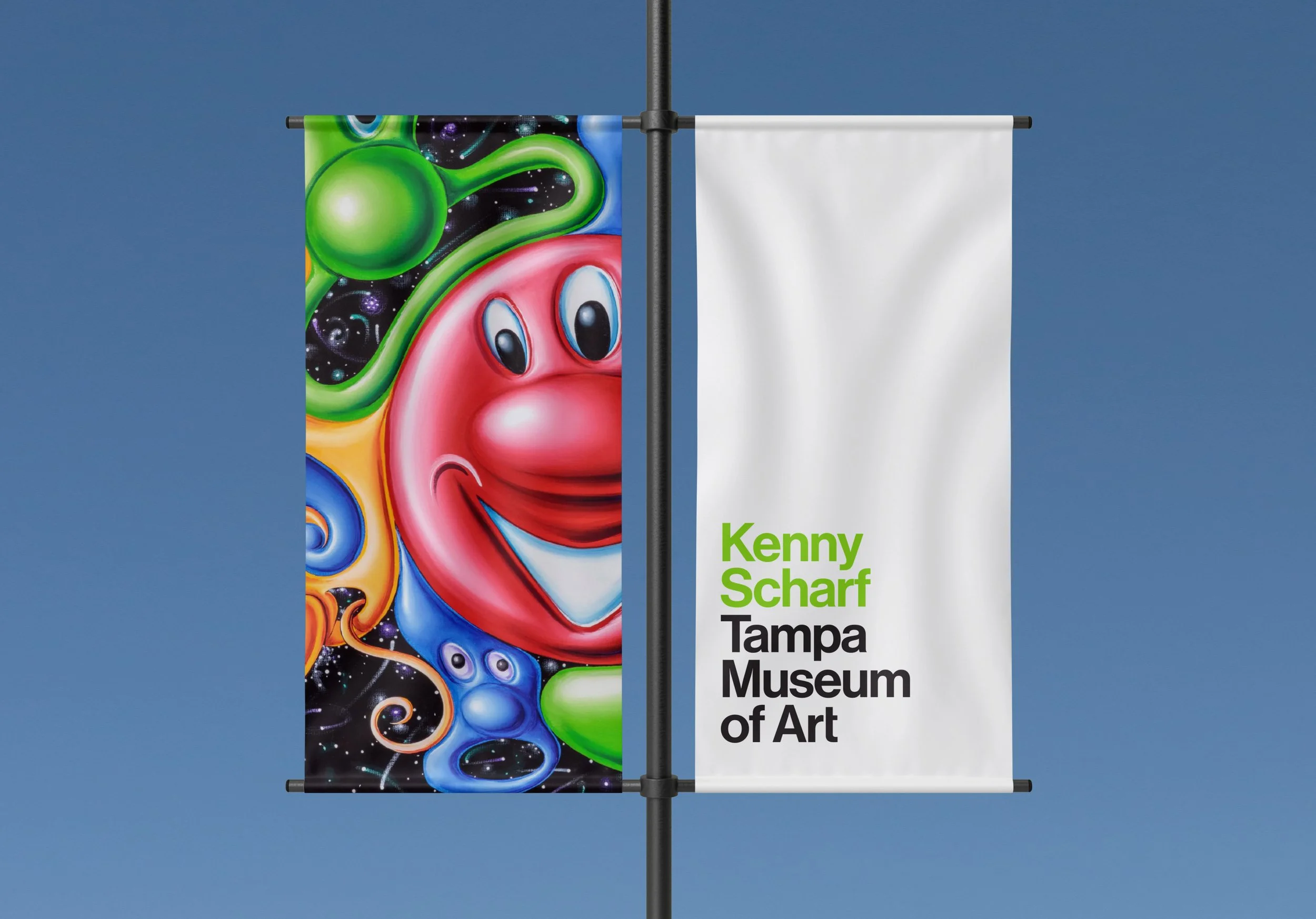
Outdoor banners introduce the museum’s artworks to passersby in the Curtis Hixon Waterfront Park.
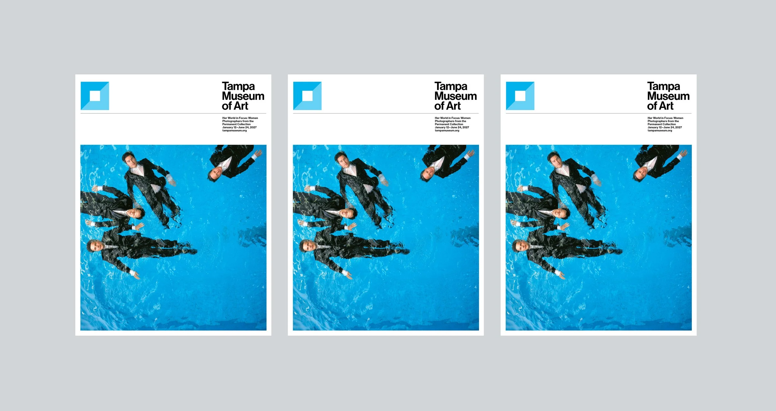

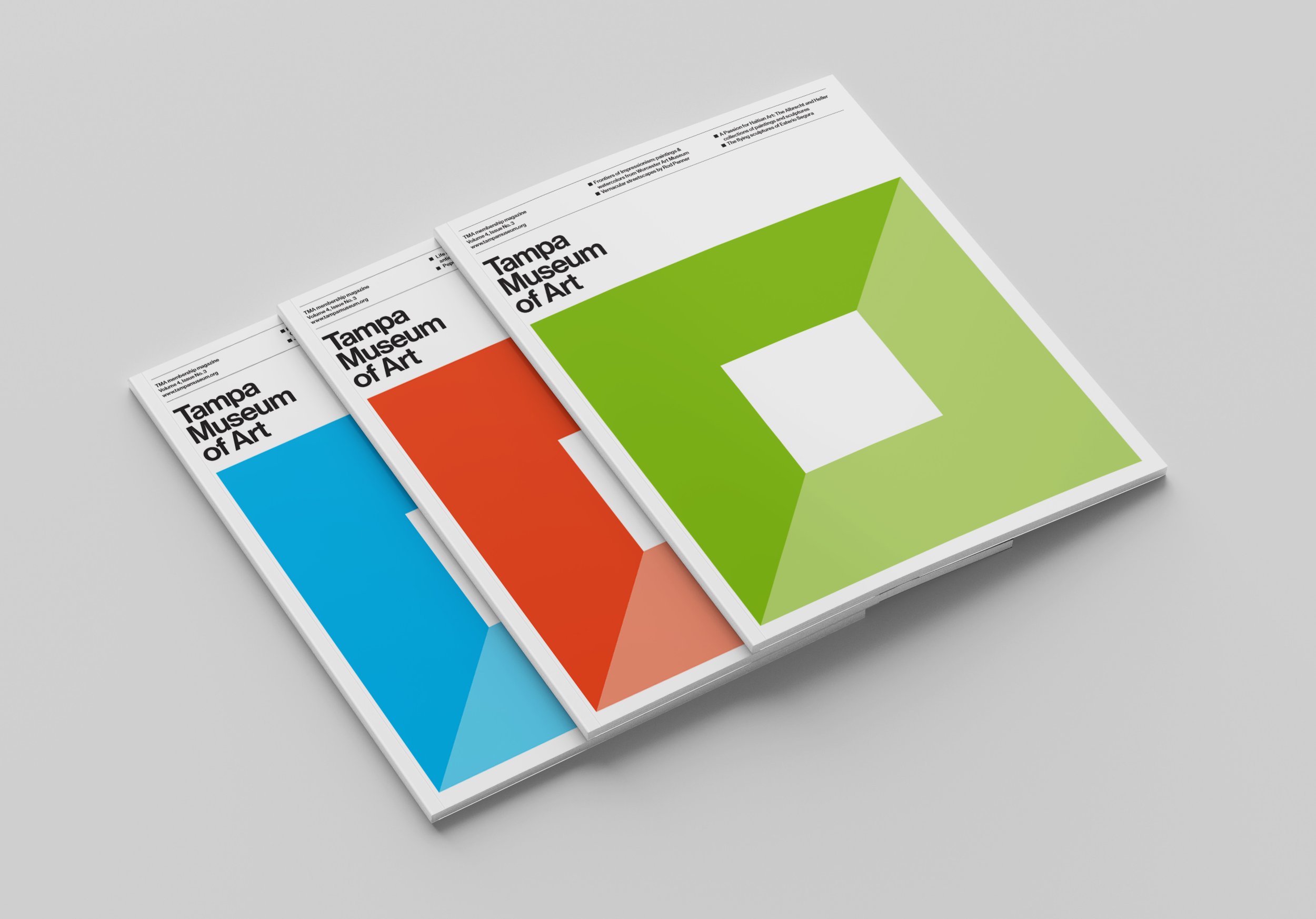
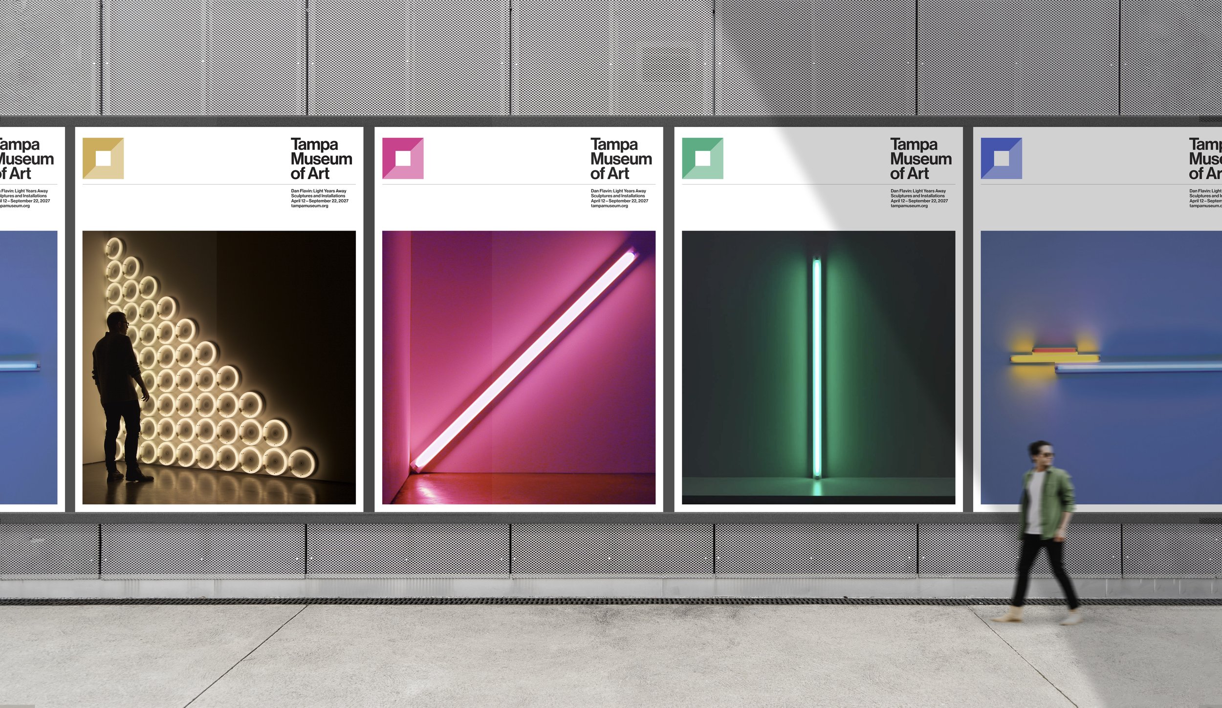
The versatile mark works in different colors and a multitude of applications. Seen here are posters, admission buttons, and a quarterly magazine the museum sends to its memebers.