Vioro Eyewear North America
Comprehensive Visual Identity
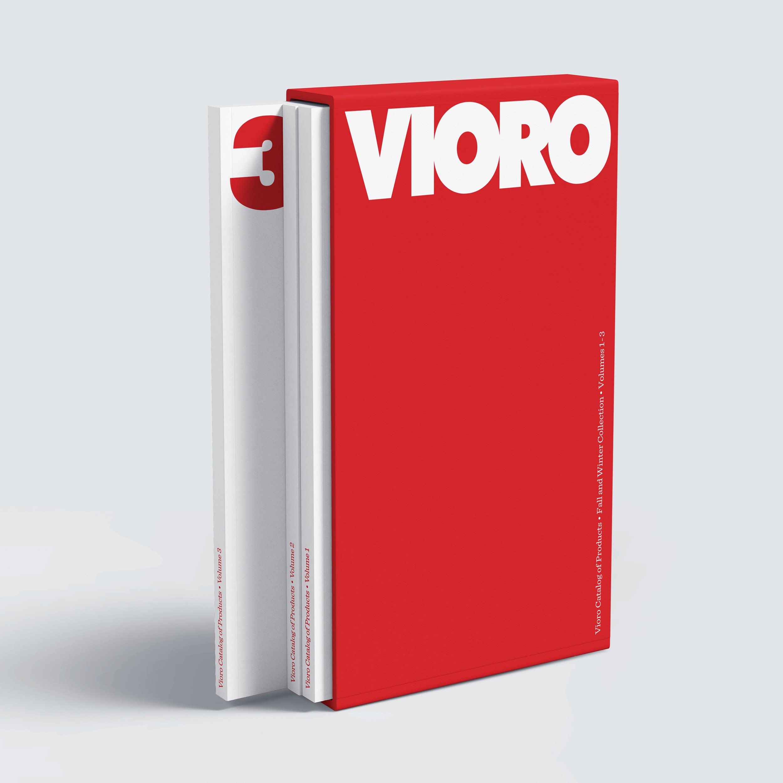
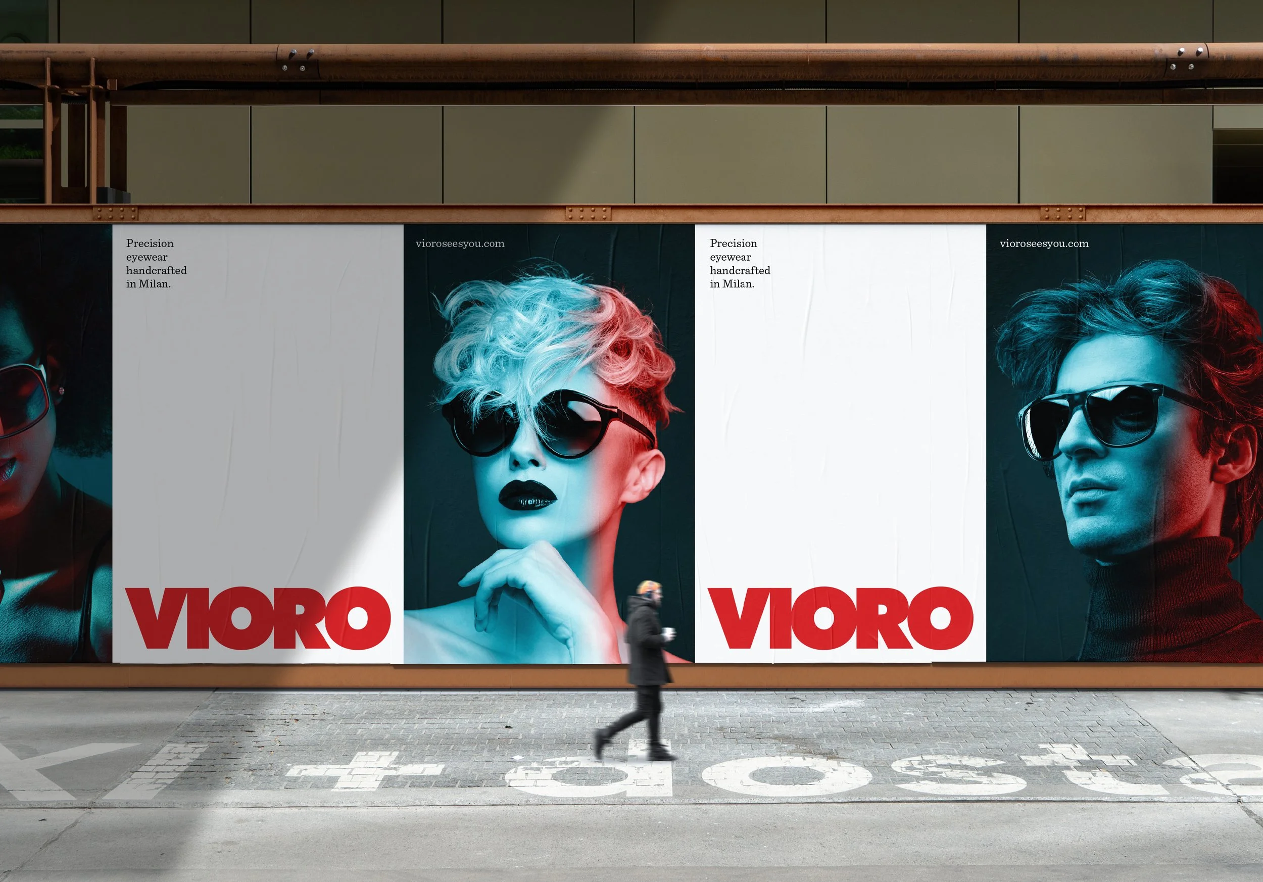
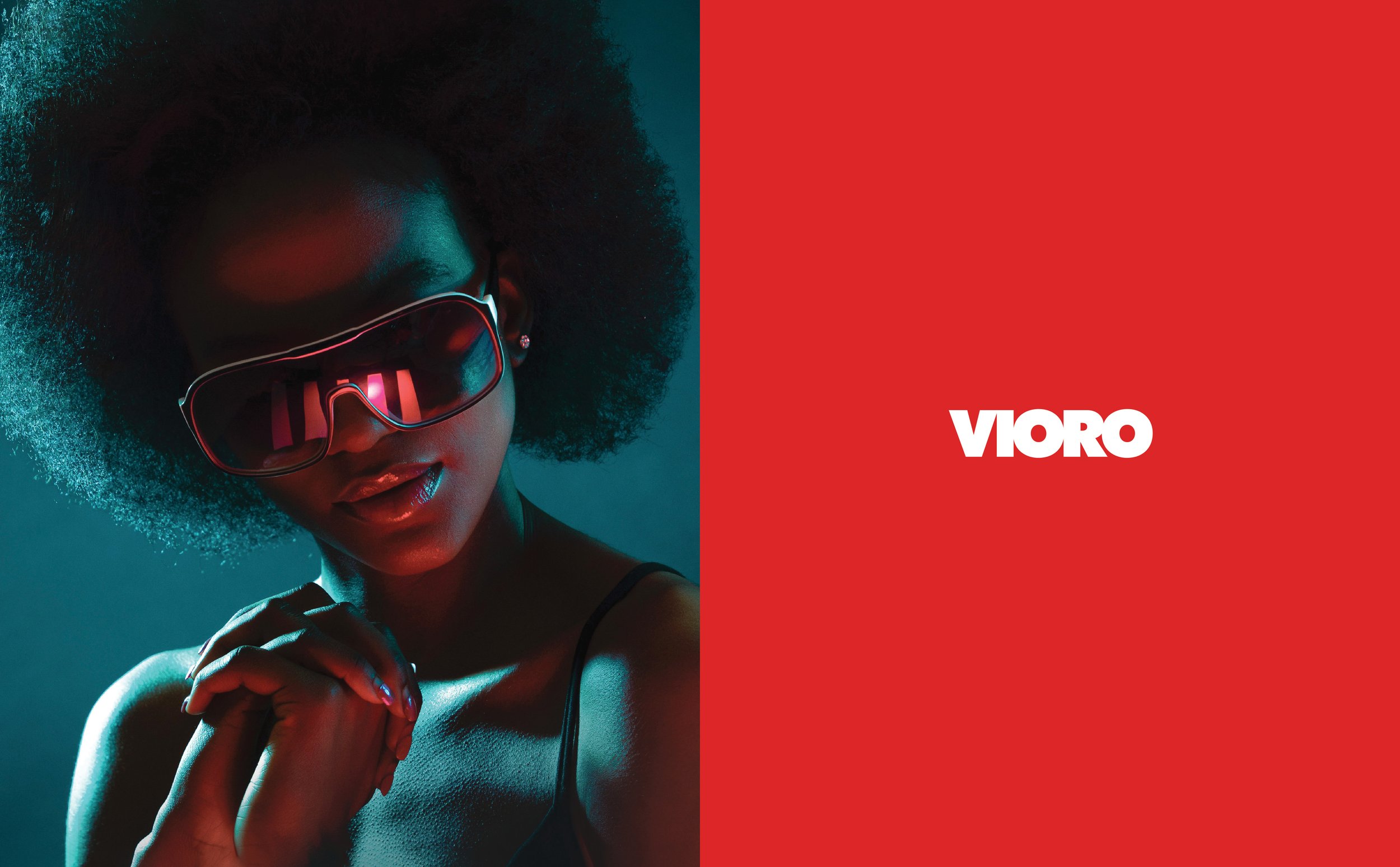
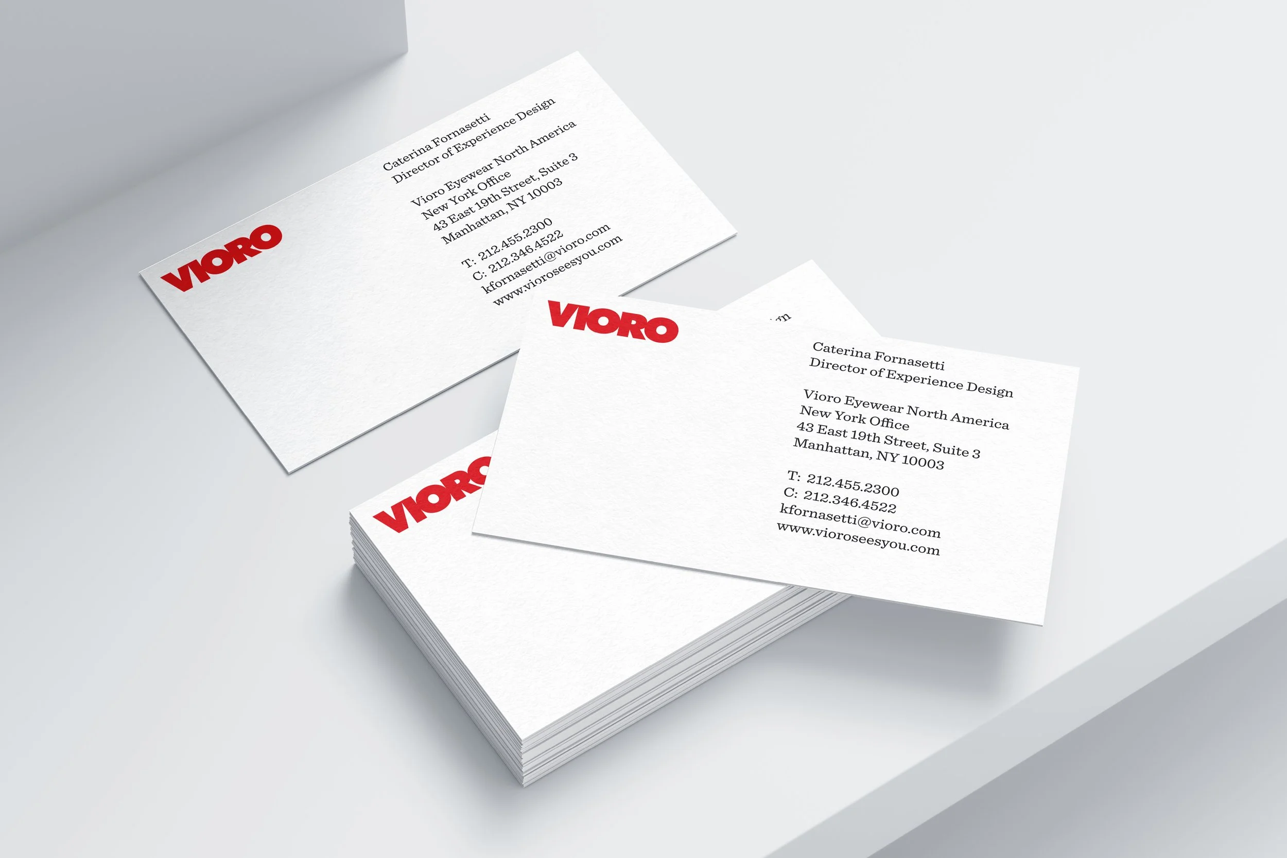
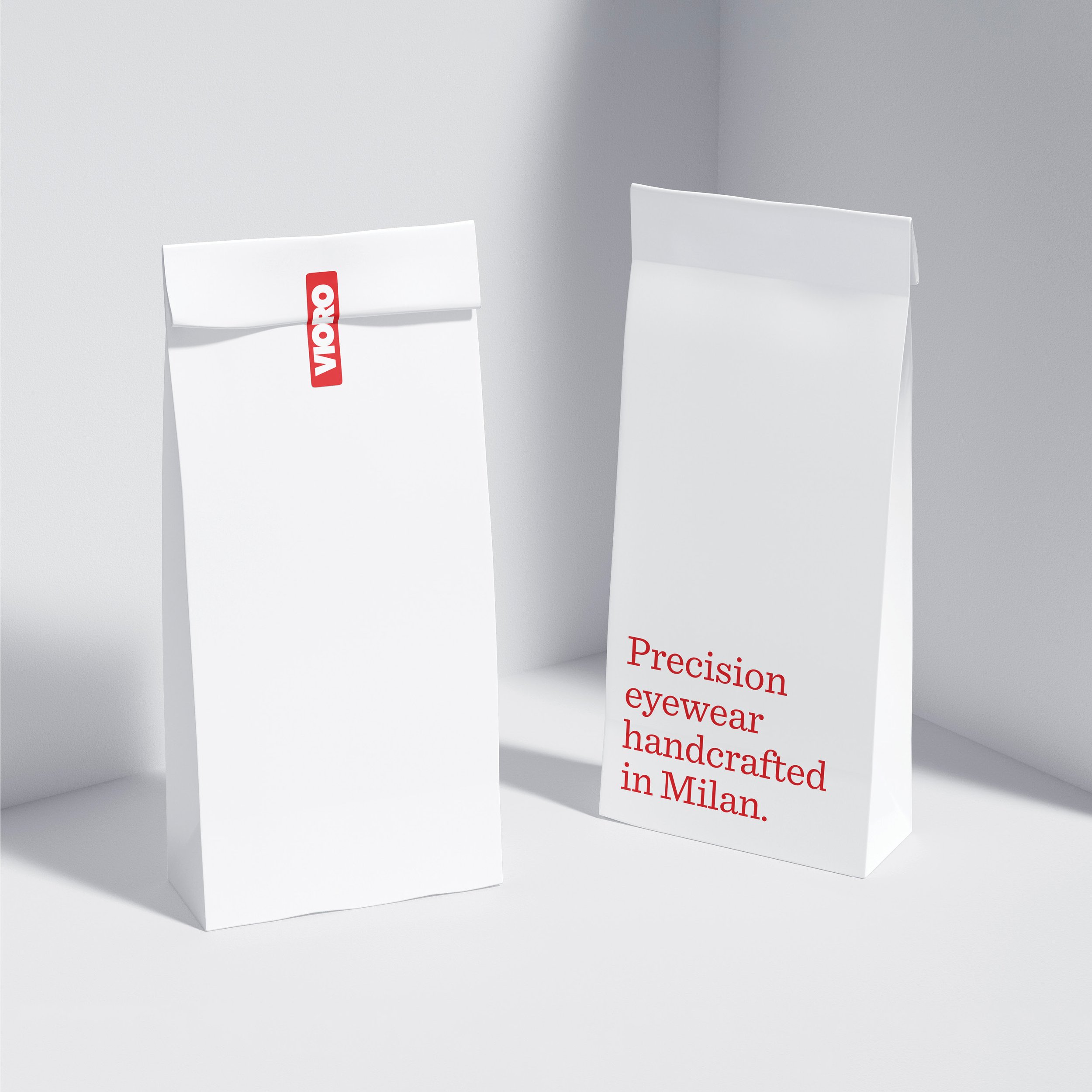
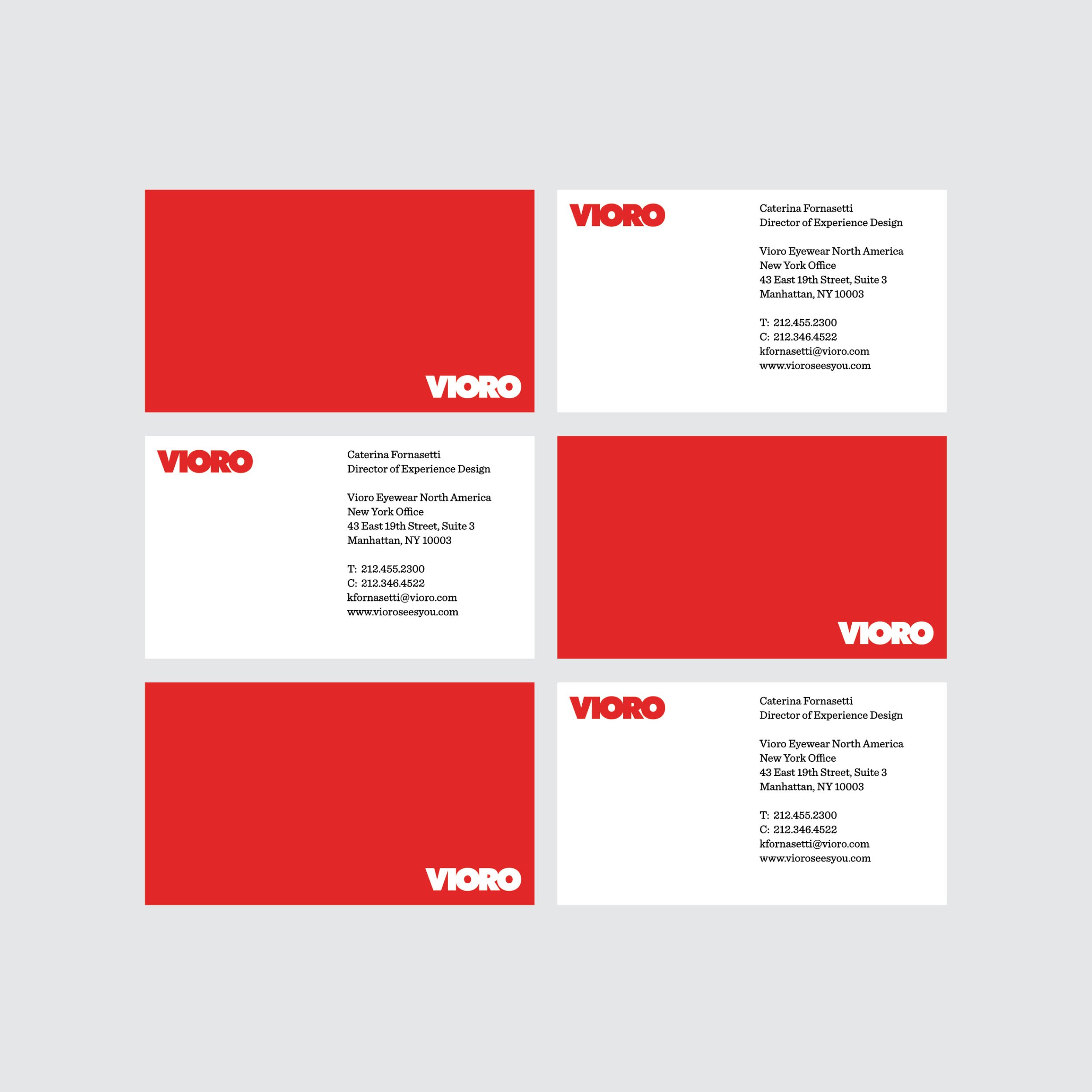
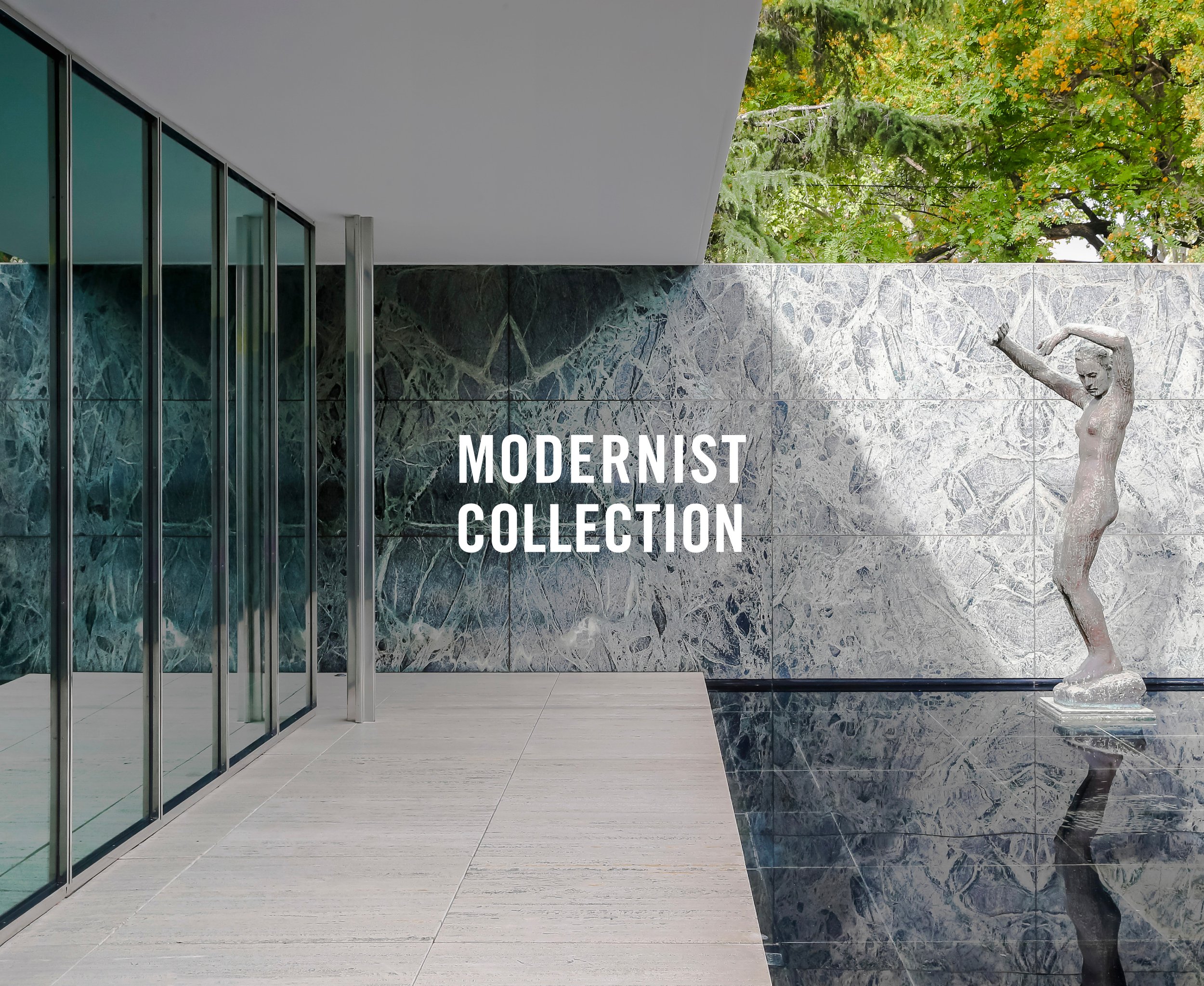
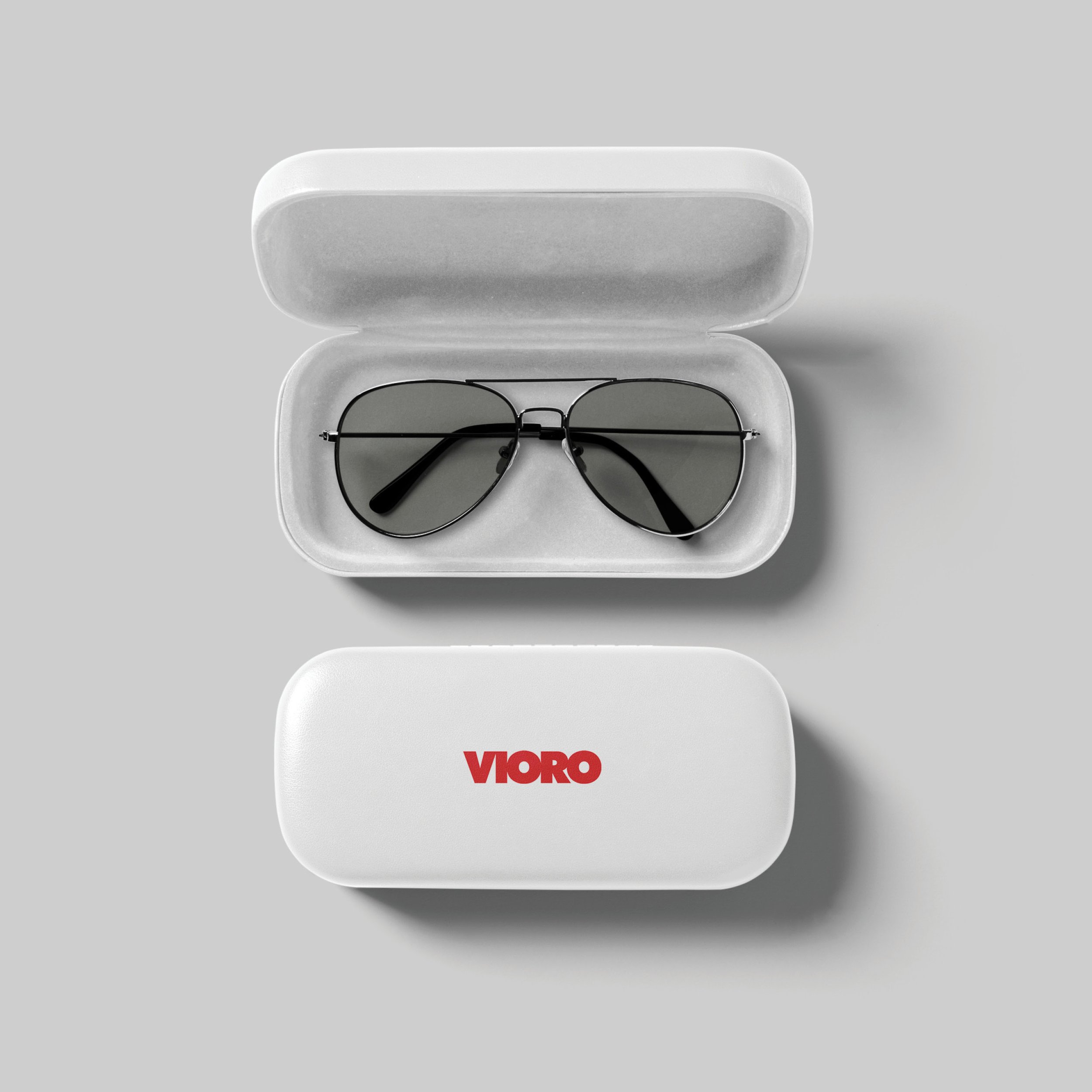
We initially designed a type-only wordmark that formed the foundation for this Milan-based eyewear brand and packaging design. To augment that, we created a signature photography style for Vioro’s advertising, taking inspiration from Caravaggio’s paintings — emphasizing dramatic side-lighting and incorporating the brand’s signature shade of warm red.
Project scope: Comprehensive branding system including logo, typography system, photography art direction, packaging, and advertising
Typefaces: Futura by Paul Renner, Futura Extra Bold by Edwin W. Shaar

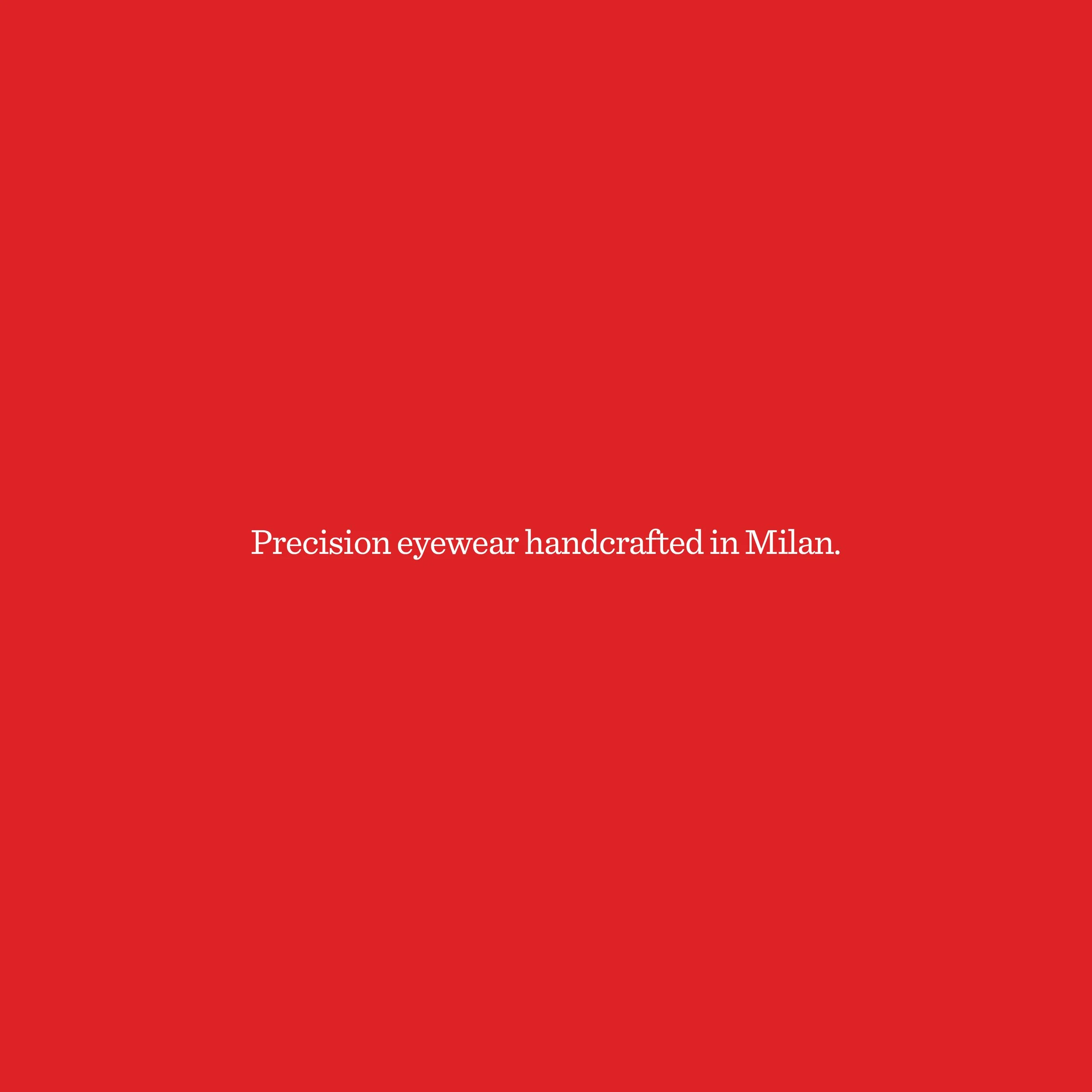


“Chromobranding” is a strategic decision to link a brand’s identity with one distinctive color, rather than a color palette of multiple hues.
When implemented appropriately, the brand color becomes a valuable part of its visual identity, as memorable as any logo, typeface or tagline.